Hola,
I'm Andrea

I design design systemsscalable componentsaccessible interfacesclear documentationbrand experiences

Product Designer @ Manyone · Lecturer @ UOC Barcelona ·
SCROLL
Andrea del Prado

I'm a Product Designer specialised in Design Systems, with a background in Fine Arts, Photography and Graphic Design.

I build the components, documentation and onboarding that help big brands stay consistent, and help teams build faster.

5+Years of experience
6+Global brands
2K+Cups of coffee
Latest projects
How I work

Design systems people actually use.

A system is only as good as its adoption. I design for the people who use it, not just the screens it produces.

  • 01

    Built to scale

    Components that flex across products and brands without breaking the core rules.

  • 02

    Accessible by default

    Usability and accessibility are part of the component spec, not a later audit.

  • 03

    Documentation as a product

    Guides, tutorials and best practices written for designers and developers alike.

  • 04

    Adoption through people

    Onboarding paths, workshops and mentoring, so the system is used, and used well.

Work experience
Latest clients
Deutsche TelekomVitaMetaZurichVuelingLufthansaHyundai
Education
  • BFA Fine Arts — Universidad Complutense de Madrid
  • UX/UI Design — Ironhack
  • Creative Leadership & Innovation Management — University of the Arts London
Toolkit & languages
  • Figma (libraries, variants, variables)
  • Sketch · Axure · Principle · Adobe CC · Blender
  • Spanish (native) · English (full professional)
Art workPhotography · 3D · Fine art

Before design, there was photography. My Fine Arts background is where my eye for composition, colour and detail comes from.

← All projects Deutsche Telekom · Design System
Redefining Telekom's Design System

ClientDeutsche Telekom
RoleUX-UI / Product Designer
AgencyManyone
TimelineOngoing collaboration
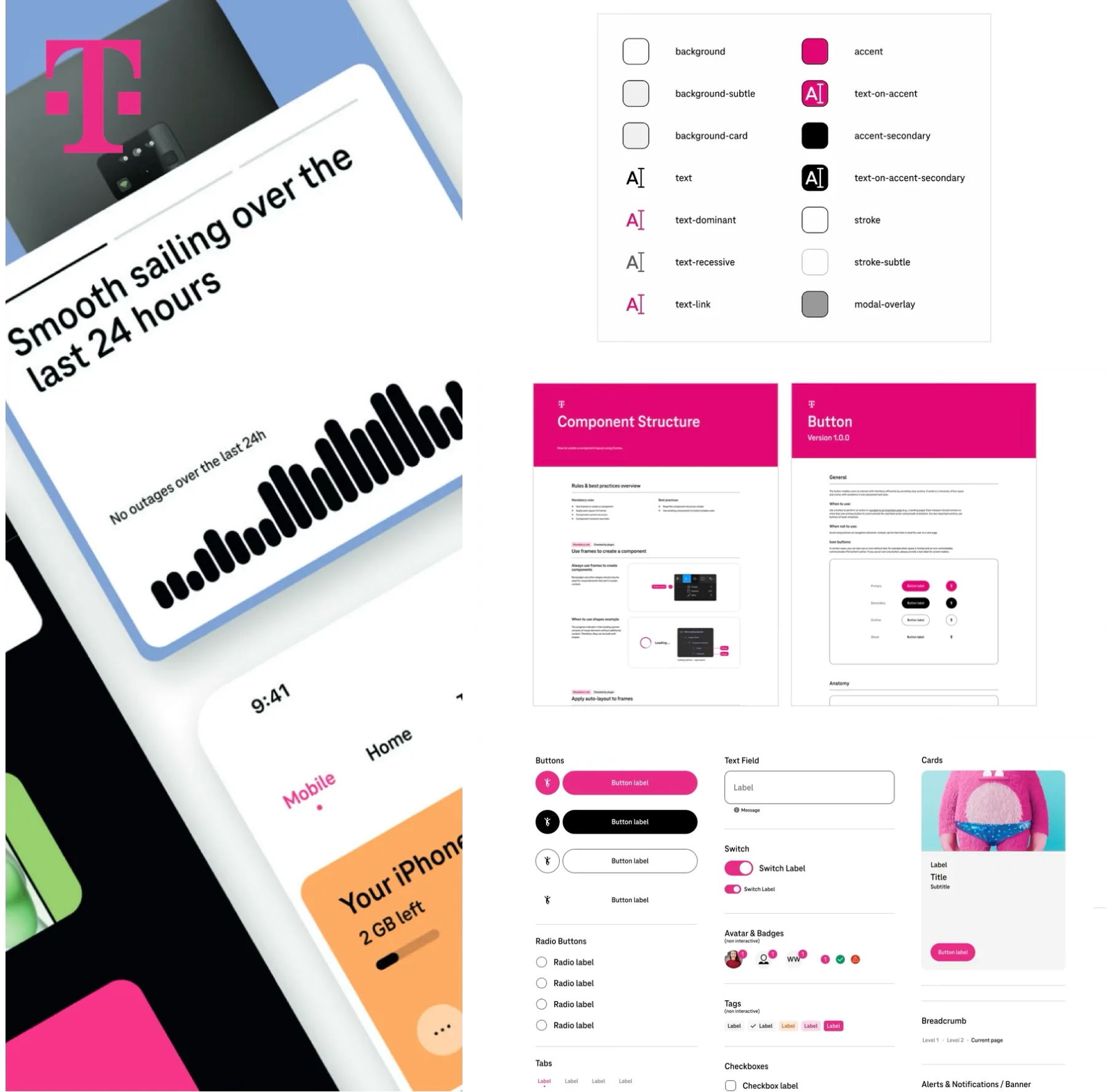
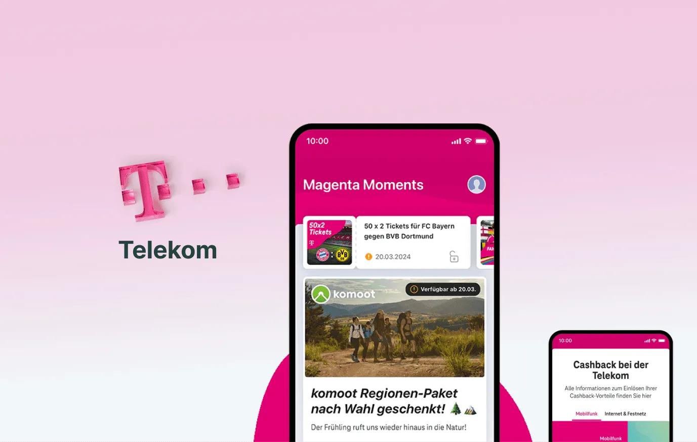
Telekom design system: Magenta Moments and Cashback screens
Context

Deutsche Telekom is one of the world's leading telecommunications companies, providing mobile, broadband and digital services across Europe and beyond. I work on redefining and enhancing its existing Design System, used across a large family of products.

Problem
  • Designers were not using the Design System consistently.
  • The complexity of the system discouraged adoption.
  • The large number of products led to multiple DS variations and inconsistencies.
  • Designers and developers struggled to find clear information or guidelines.
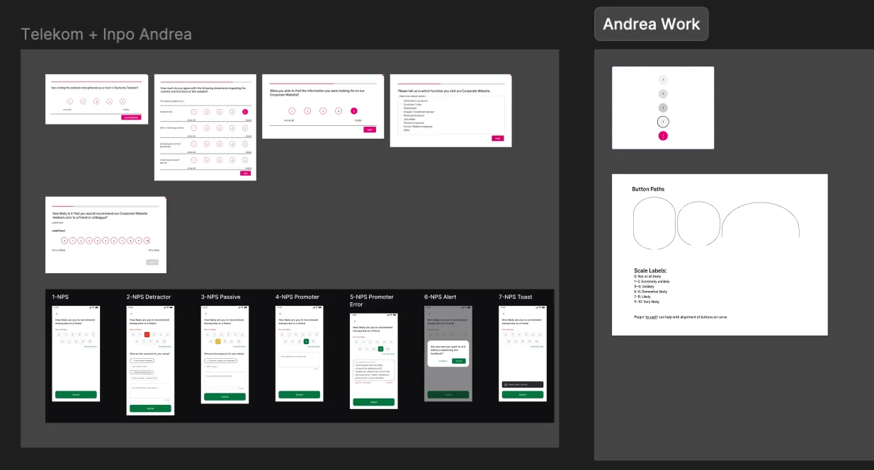
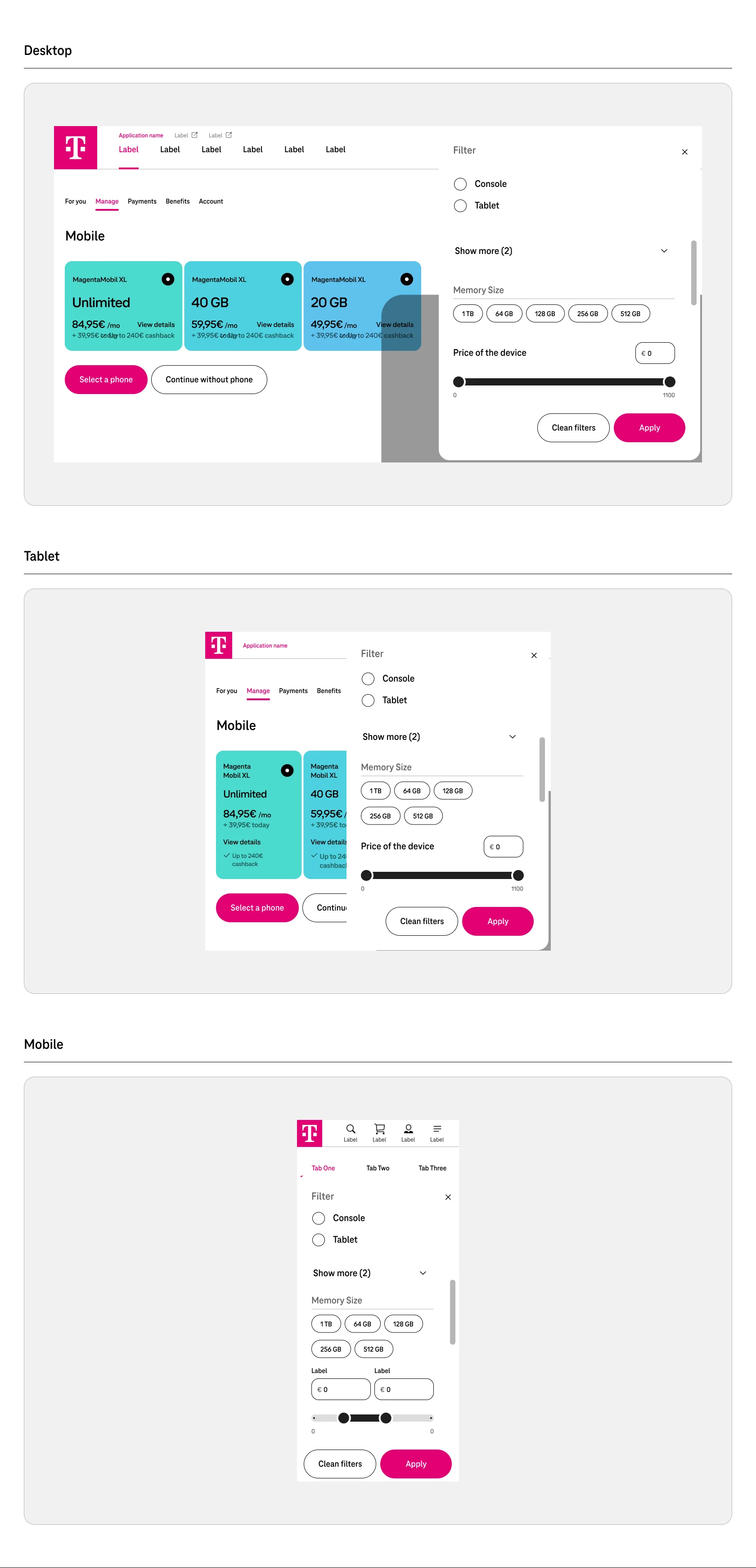
Component work in progress across Telekom products
Solution
  • Delivered a unified, accessible Design System for all Telekom products, for every team to use.
  • Established a structured documentation hub for designers and developers.
  • Implemented mentorship and workshops to ensure consistent usage.
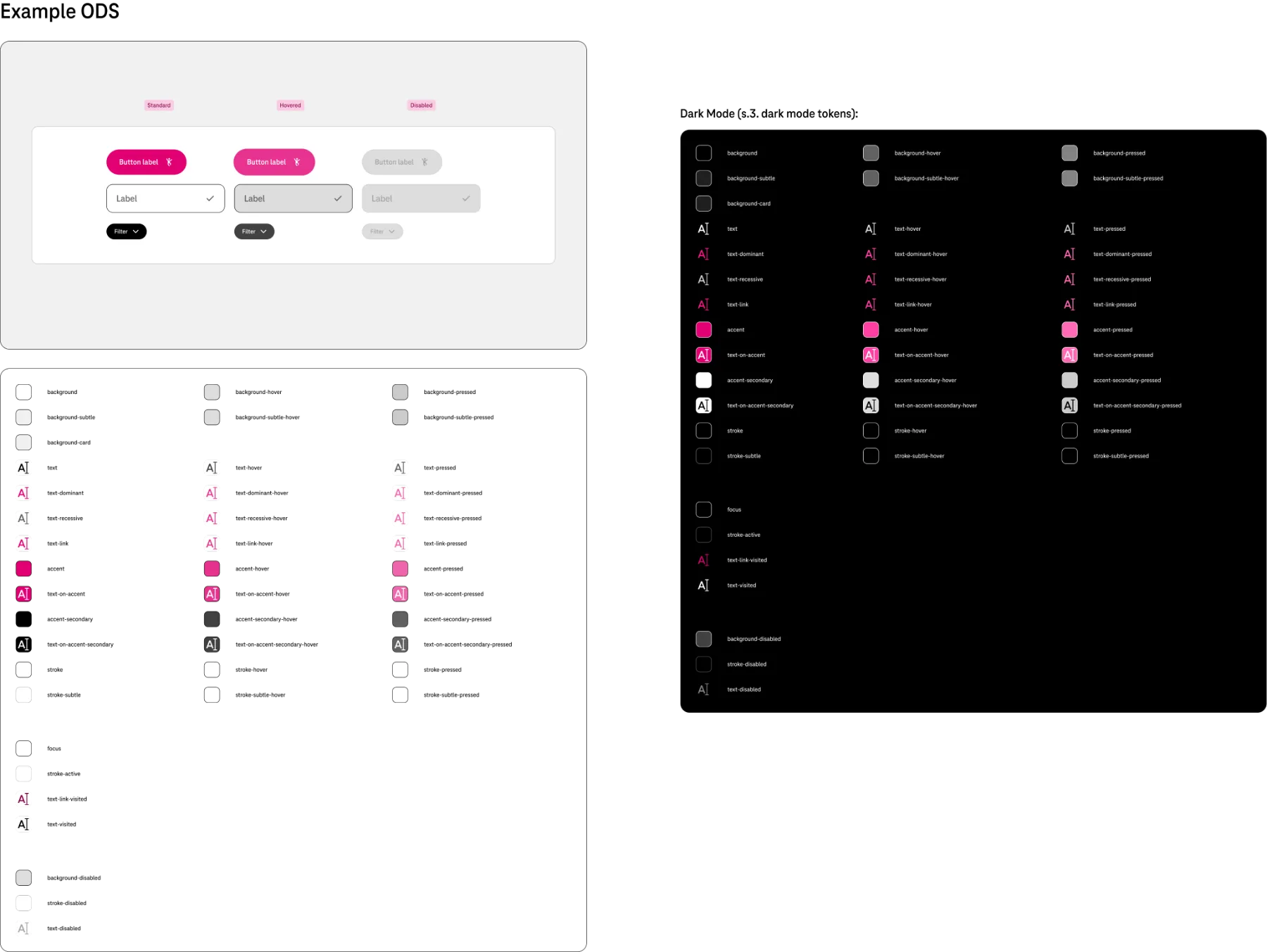
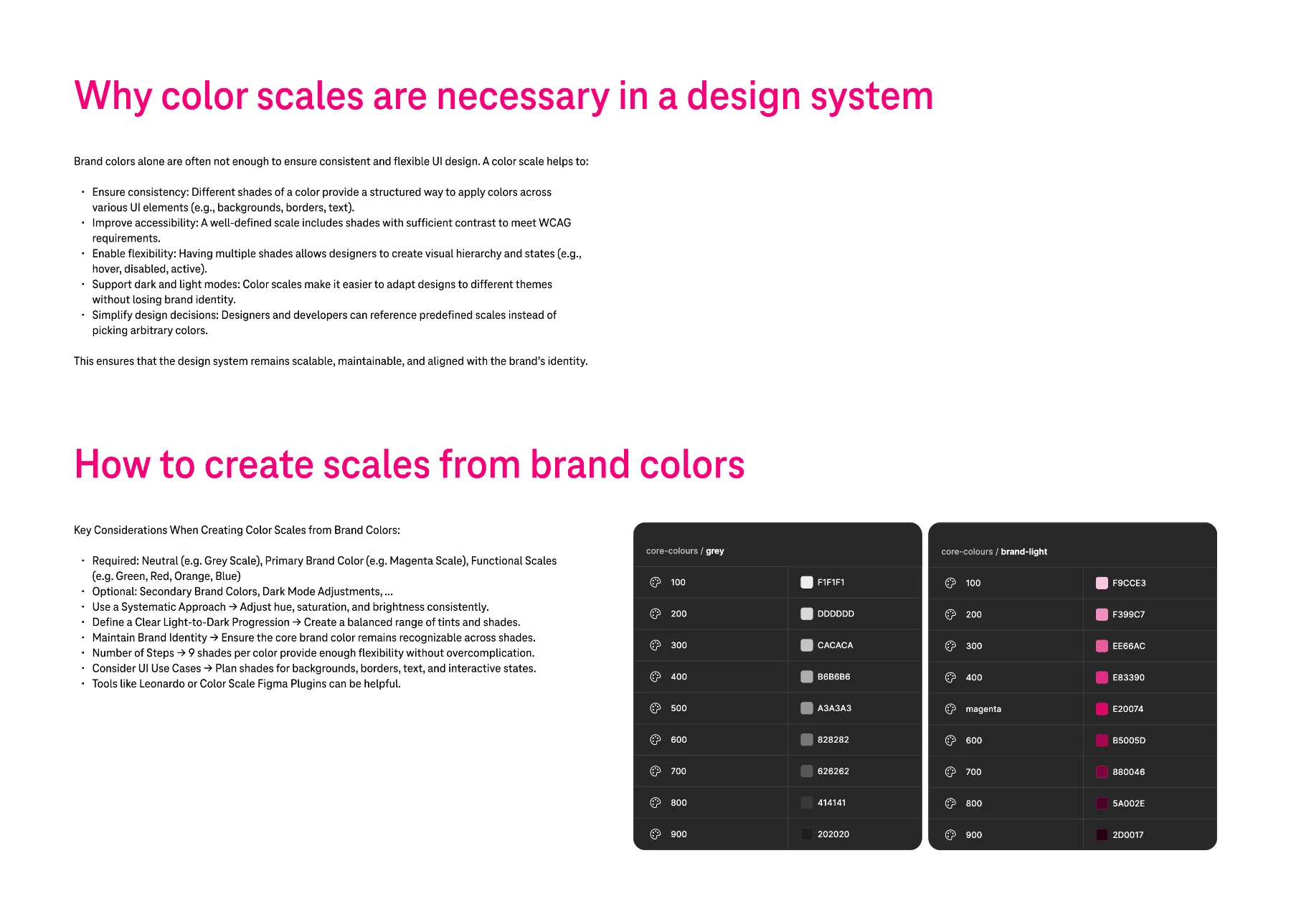
Components in dark modeGuideline: why colour scales are necessary in a design system
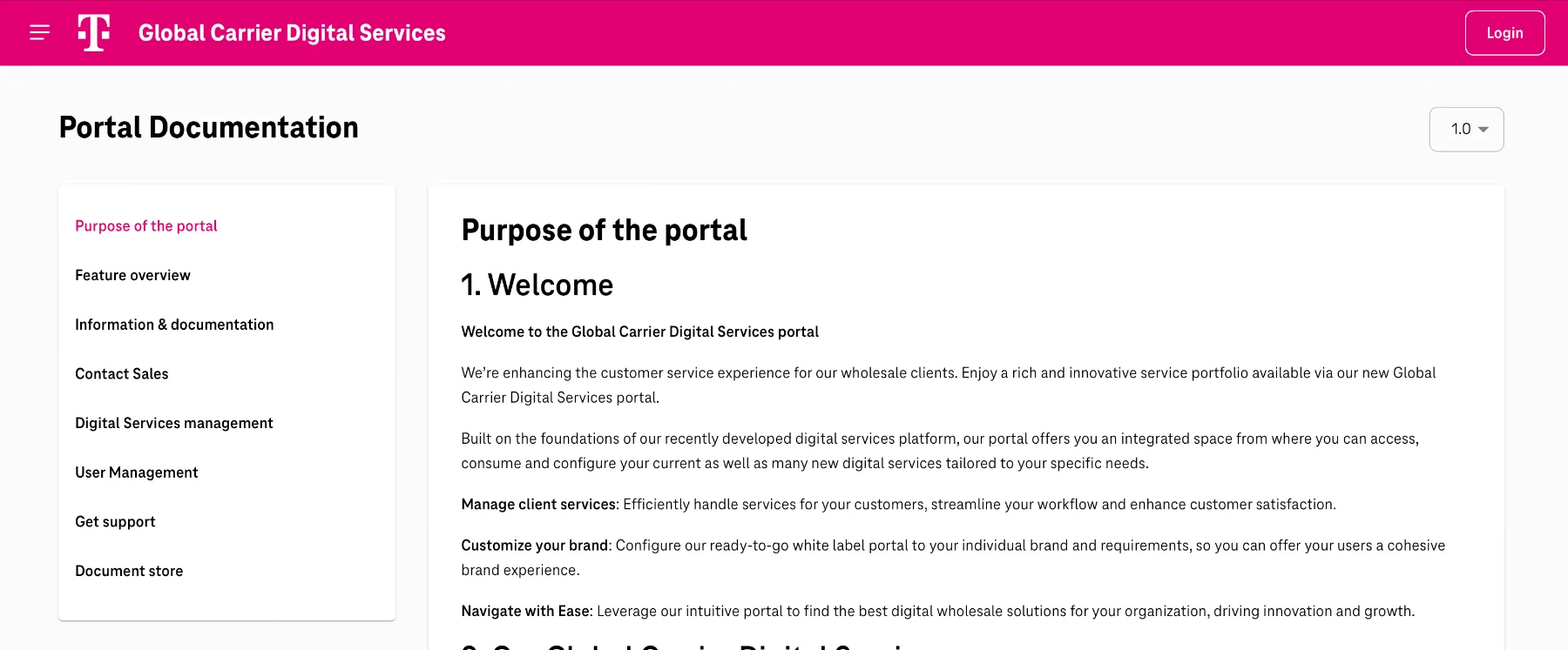
Portal documentation
Approach
  • Rebuilt core components to be scalable, consistent and easy to use.
  • Collaborated closely with design and development teams for alignment.
  • Created clear documentation and onboarding materials to simplify adoption.
  • Ideated future proposals for guidelines: a Figma plugin and an AI assistant.
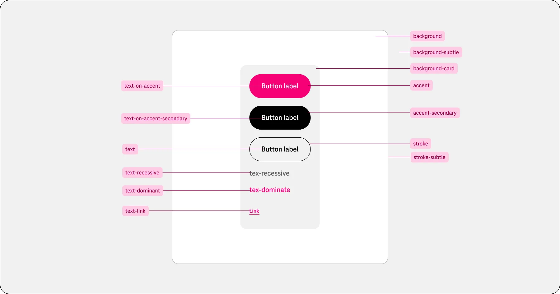
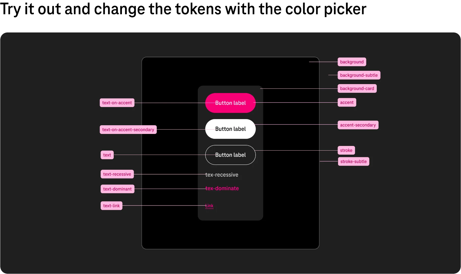
Button anatomy and tokens, light modeButton anatomy and tokens, dark mode
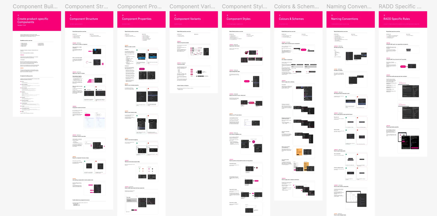
Component sets
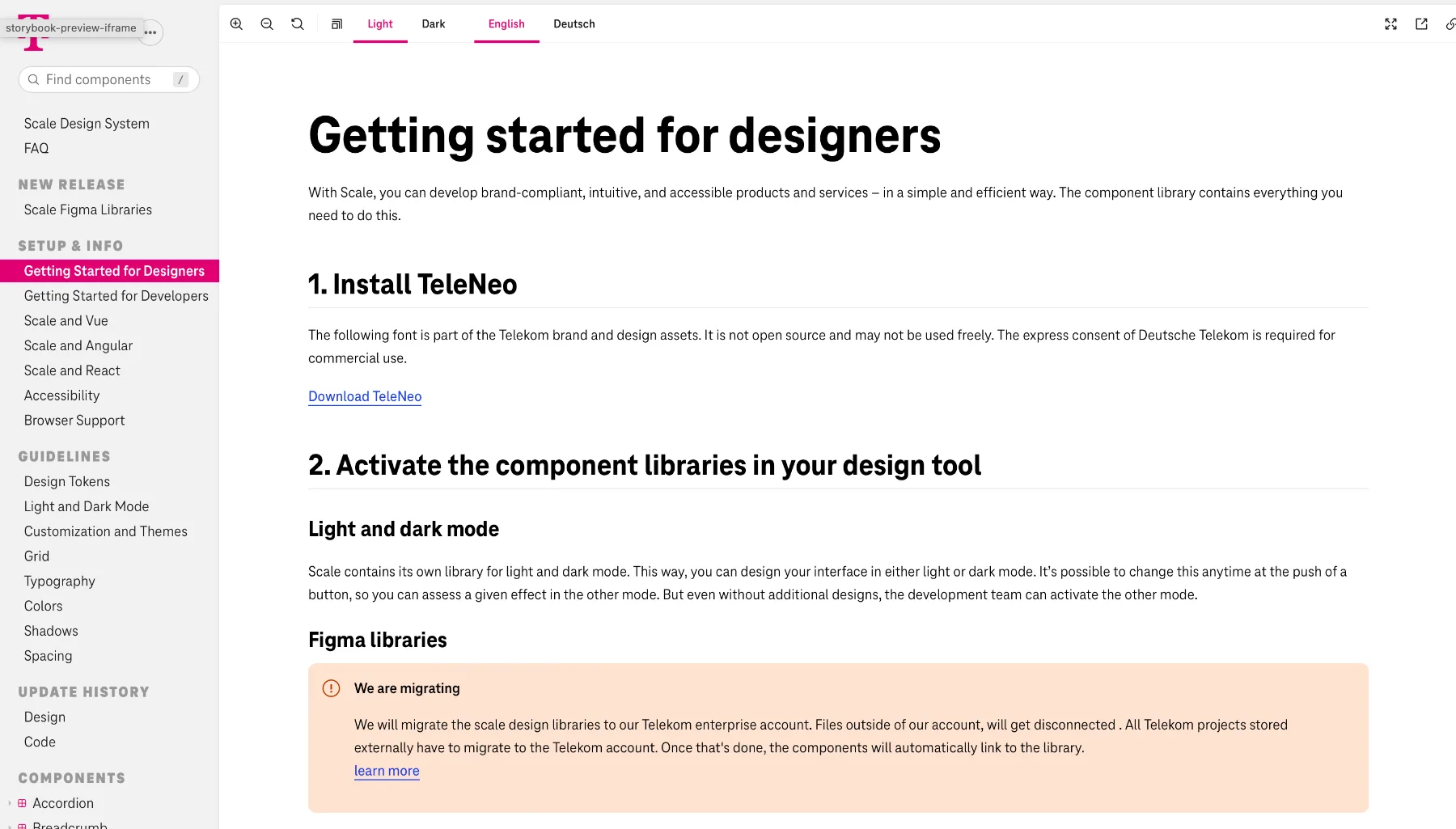
Getting started for designers: documentation
Results

A rebuilt Design System foundation, components and guidelines, used to design products such as Magenta Mobile, plus a chatbot assistant: an AI tool that answers questions about the guidelines, so designers and developers find what they need faster.

Telekom Workspace: the AI chatbot assistant and component guidelines in action

Design System foundation, components and guidelinesMagenta Mobile product built with the system

A design system only works when people adopt it. That's why documentation, mentoring and tools are as much part of my job as components.

← All projects Vita · Design foundations

Elevating Vita's digital touchpoints

ClientVita (Switzerland)
RoleUX-UI / Product Designer
IndustryPensions / Finance
Timeline4 months
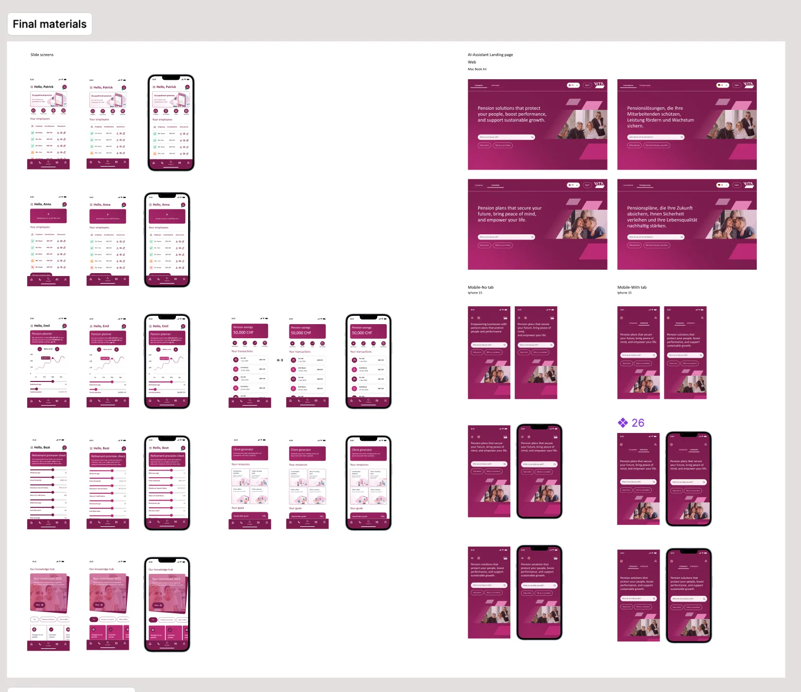
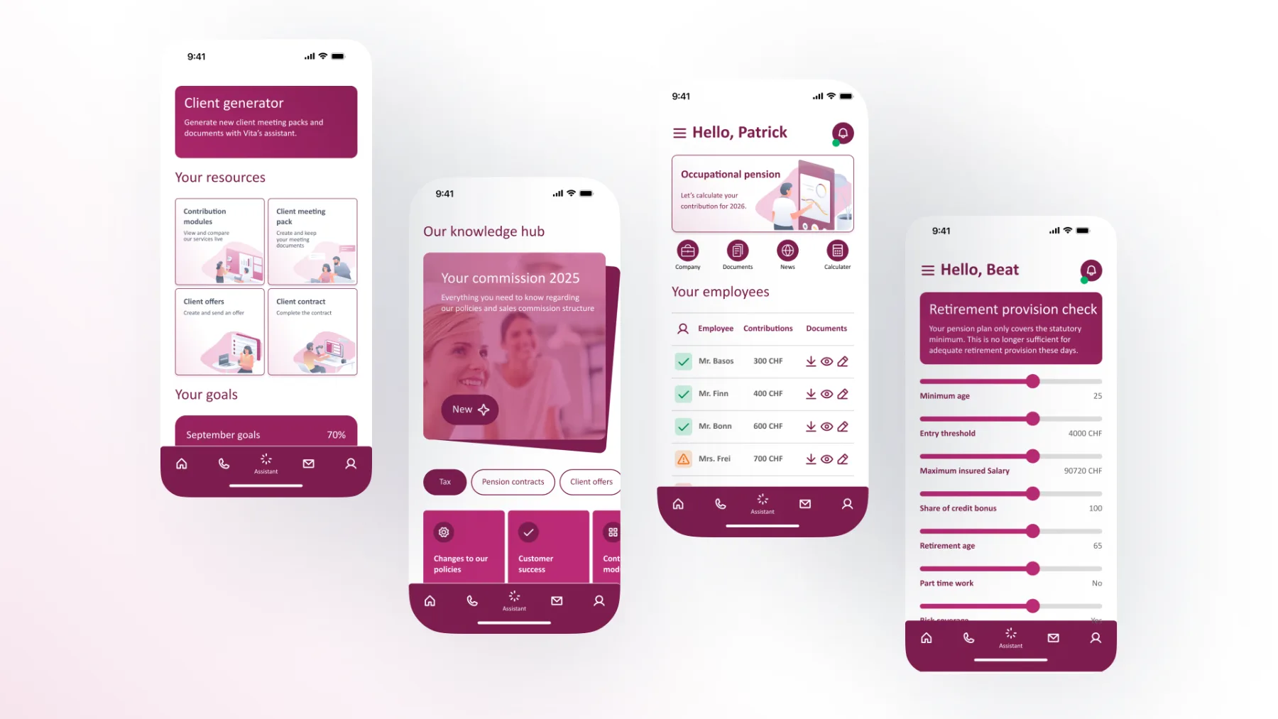
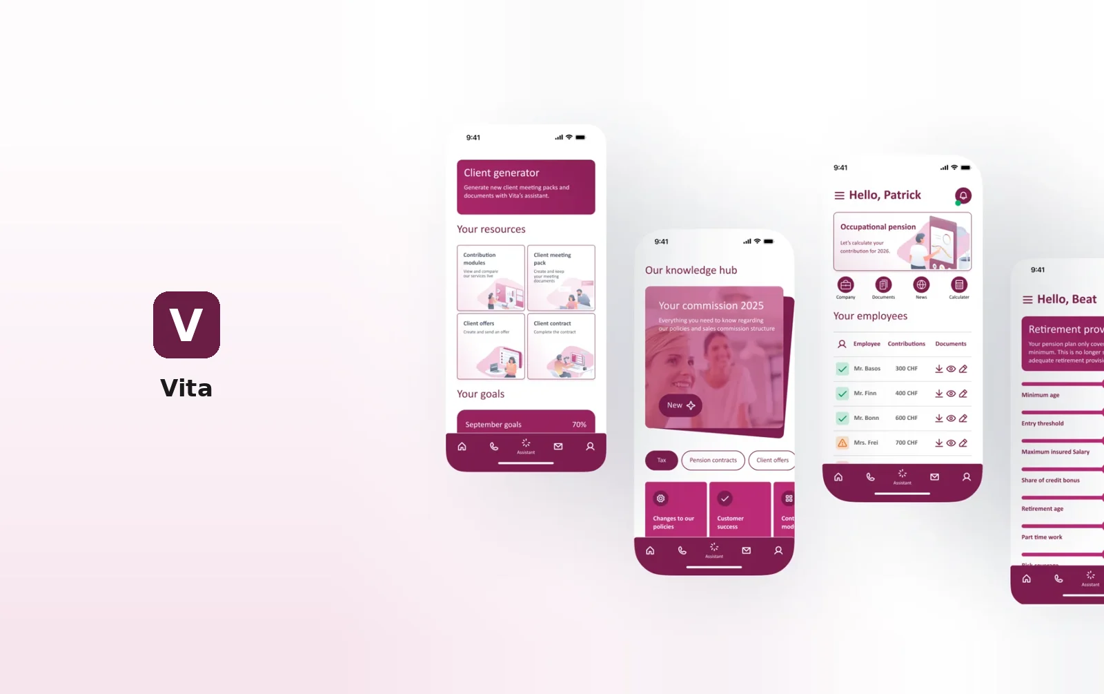
Vita mobile app screens
Context

Vita is a Swiss pension foundation providing transparent, sustainable retirement solutions for companies and individuals. Its digital touchpoints serve two very different audiences, HR teams choosing a pension plan for their company and employees planning their own future, in several languages and across desktop and mobile.

The product had grown screen by screen, without a shared visual language. My brief was to give Vita a foundation it could scale on, and to show what the experience could become.

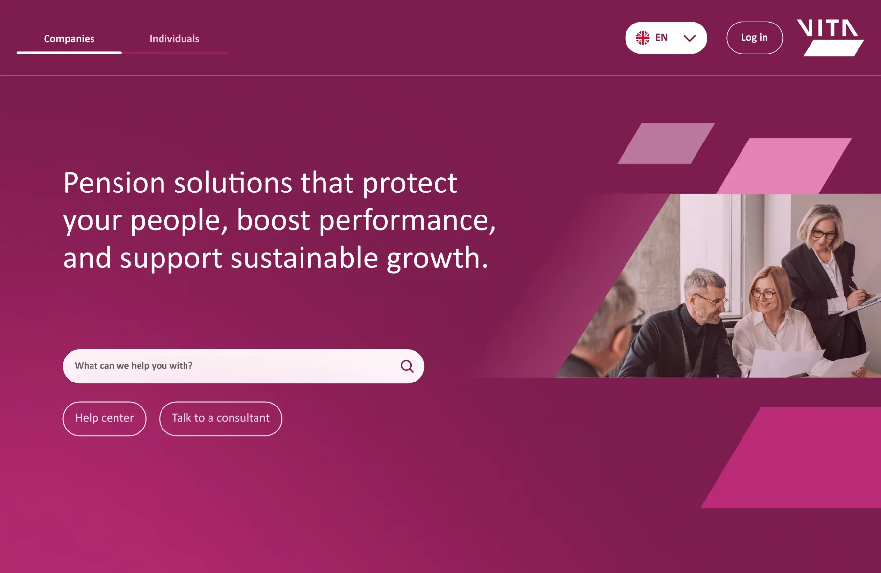
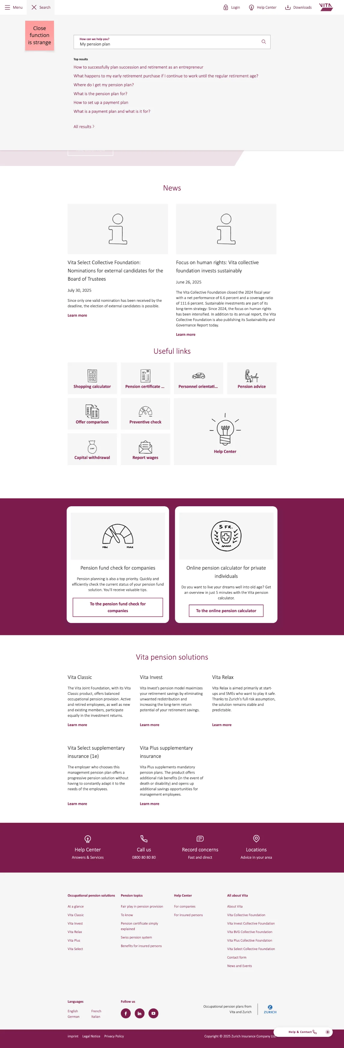
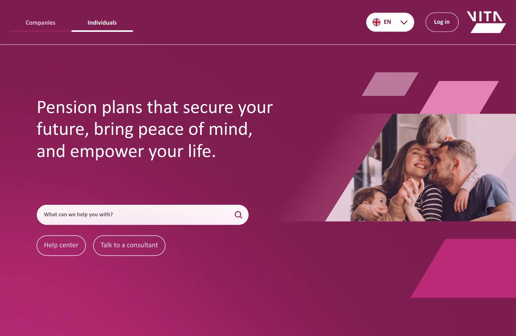
Vita website for companies
My role
  • Owned the design foundations end to end: audit, token architecture, component library and icon set.
  • Defined the motion language and built prototypes to validate it with stakeholders.
  • Worked directly with the Vita team in iterative reviews, aligning design decisions with brand and business needs.
  • Shaped the product vision with forward-looking concepts beyond the initial scope.
Problem
  • Lack of visual consistency across the product.
  • No clear design foundation: no tokens, components or animations.
  • A need to strengthen the visual identity and overall user experience.
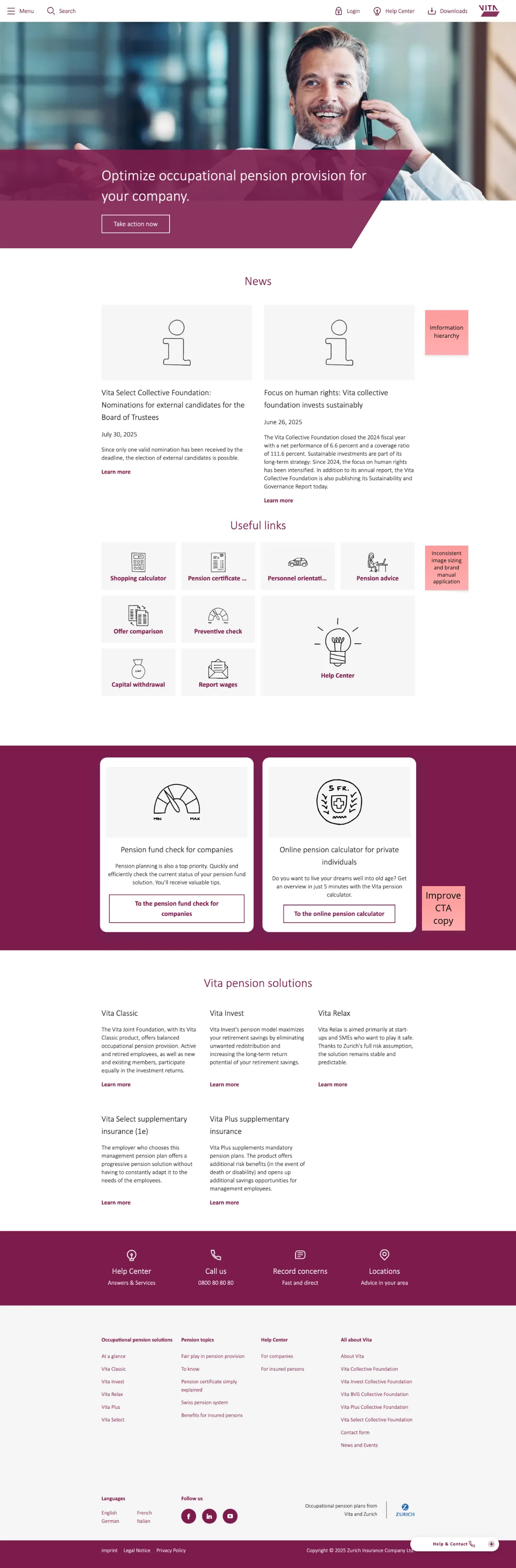
Existing Vita pages before the redesignExisting Vita pages before the redesign
Solution
  • Built design foundations: tokens, components and visual principles.
  • Developed animations and micro-interactions aligned with the brand.
  • Created mockups and motion prototypes to simulate the final experience.
  • Ideated future product concepts to evolve the UX.
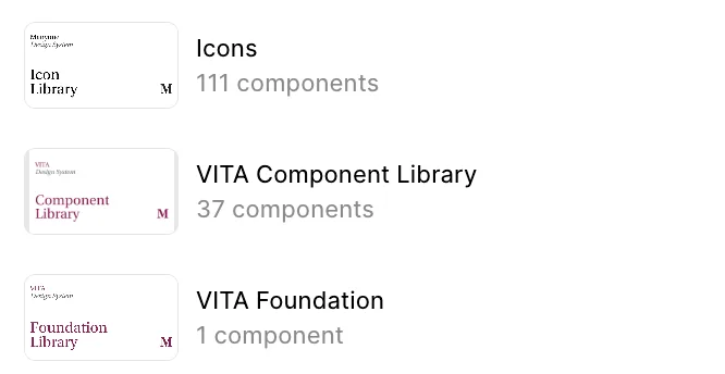
111Icons
37Components in the Vita library
4Months, from audit to prototypes
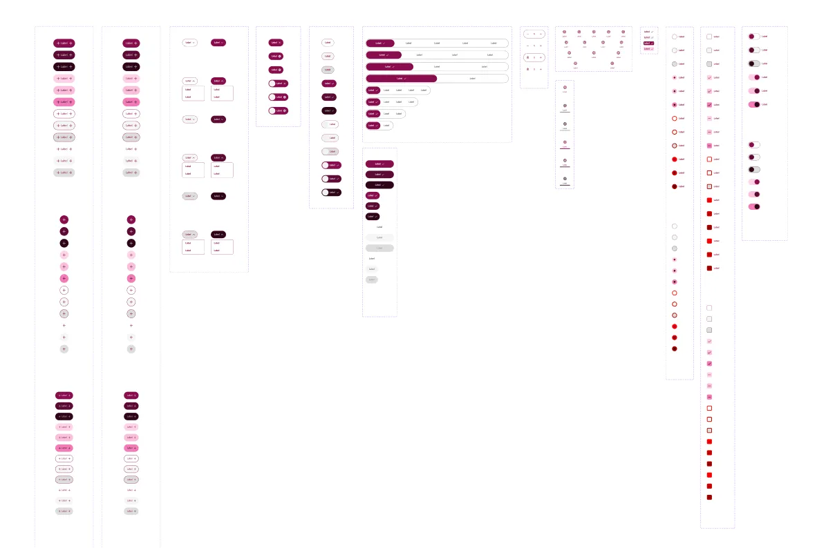
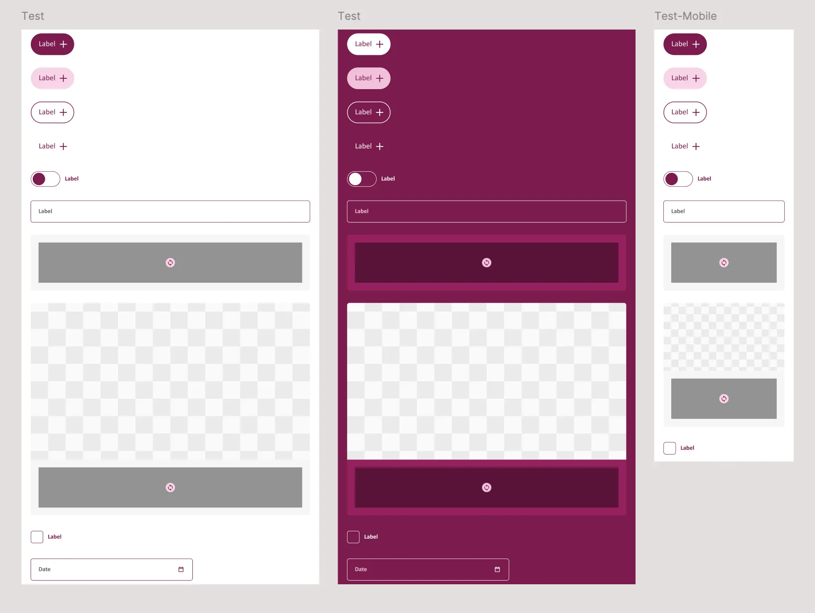
Vita libraries: icons, component library, foundationColour and token foundations
Key decisions

A design system is a set of decisions that other people will build on. These were the ones that shaped Vita's foundation:

01

Semantic tokens, not raw colours

Components reference roles such as background, accent, text-on-accent or stroke instead of hex values. Designers pick intent, and the brand can evolve without touching every screen.

02

Theming built in from day one

The same components render in neutral and brand themes, light and dark. Theming is a property of the system, not a redesign for each new context.

03

Three libraries, clear ownership

Foundation, components and icons live in separate libraries. Teams can update the 111 icons or the 37 components independently, and the foundation stays stable.

04

Swappable, composable components

Components are built so variants and content can be swapped in place. That makes the library faster to use and easier to maintain than a collection of one-off screens.

Approach
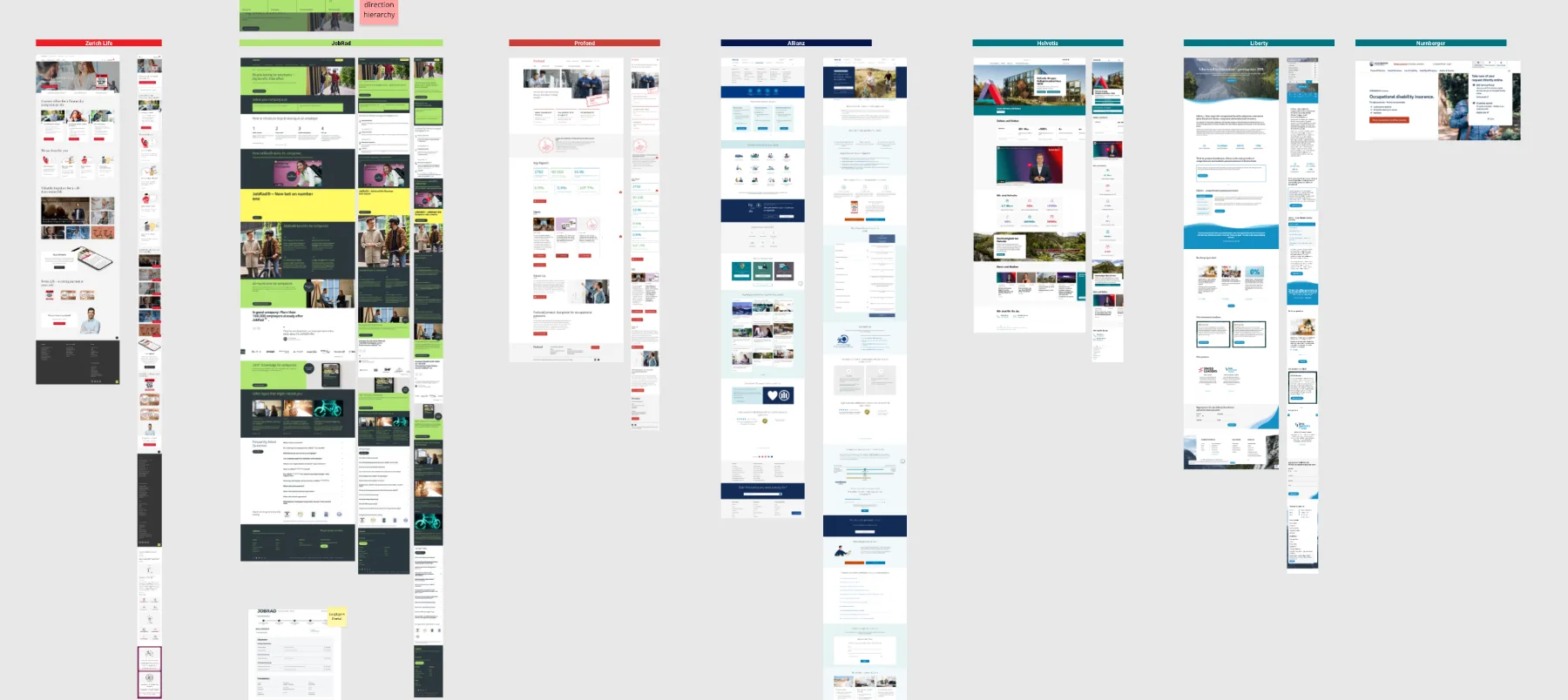
  • Discovery: assessed existing visuals and identified inconsistencies.
  • Design foundations: established scalable tokens and components.
  • Motion prototyping: built dynamic prototypes to validate interactions.
  • Iterative collaboration: refined designs with the Vita team.
  • Future vision: explored forward-looking concepts to expand the product's potential.
Discovery: audit of existing visuals
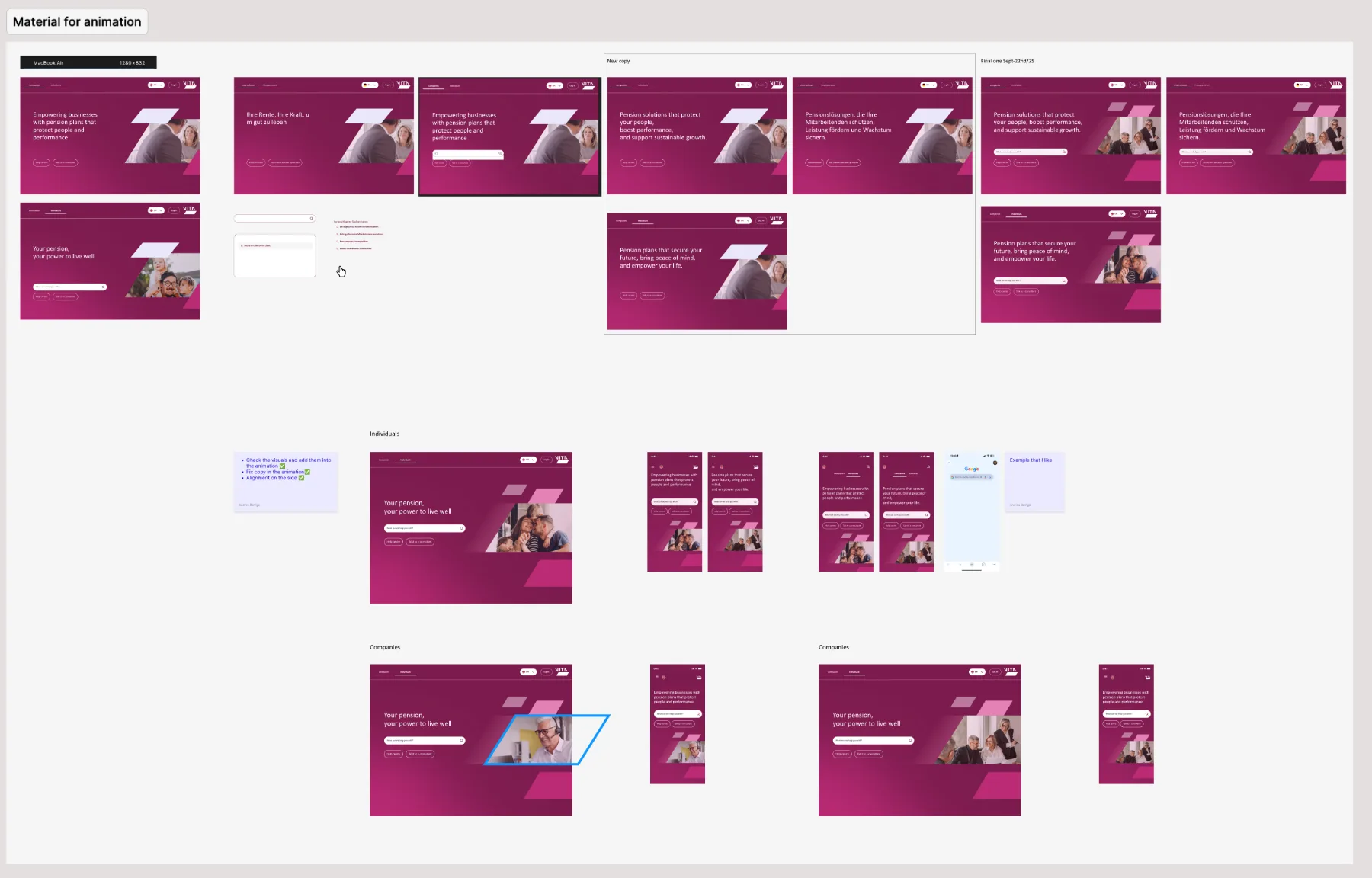
Flows and screensAnimation storyboards
Motion

Motion was treated as part of the foundation, not decoration. I defined how components and themes transition and how key moments, like switching audience or language, should feel, then built motion prototypes so the Vita team could judge the experience before any code was written.

Results
  • A complete design foundation: semantic tokens, themes and visual principles.
  • A 37-component library and a 111-icon set, built to be swapped and composed.
  • Motion prototypes and mockups for web and mobile that simulate the final experience.
  • Automations integrated into the tool, such as switching language across the site.
Swapping components

Motion: themed components

Motion: colour tokens

Mobile landing prototype

Automation: switching language across the site

Mobile mockupsVita website for individuals
Impact

Vita went from inconsistent screens to a shared language its team can build on. New pages start from tokens and components instead of from scratch, the brand looks the same for companies and individuals, and the motion prototypes gave stakeholders a clear picture of where the product is heading.

Good foundations are invisible. Users simply feel that everything belongs together, and teams feel that building the next screen is easy.

← All projects Strategic UX/UI redesign

Optimizing Glovo's app

ClientGlovo
IndustryDelivery
RoleUX/UI Designer, Consultant
DateOct 2021 · 2 weeks
Glovo app redesign
The problem

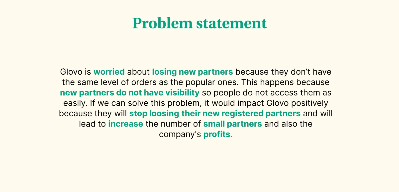
Glovo was losing new partners: they got far fewer orders than popular ones because customers rarely saw them. Solving it would help keep partners, grow the number of small stores and increase revenue.

Problem statement
Research

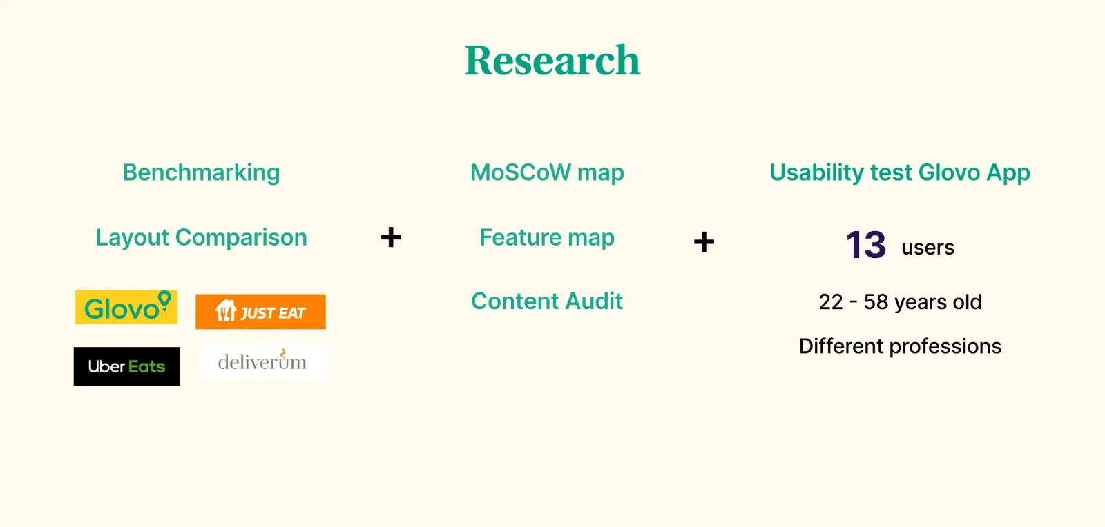
Benchmarking and layout comparison, a MoSCoW map, feature map and content audit, and usability tests with 13 users aged 22 to 58.

Research methods: benchmarking, MoSCoW, usability tests
Insights
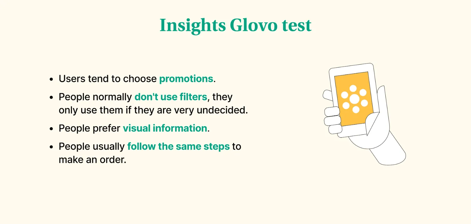
  • Users are attracted to promotions.
  • Filters are rarely used unless people are undecided.
  • People prefer visual information.
  • Users follow the same steps every time they order.
Insights from the Glovo tests
Solution

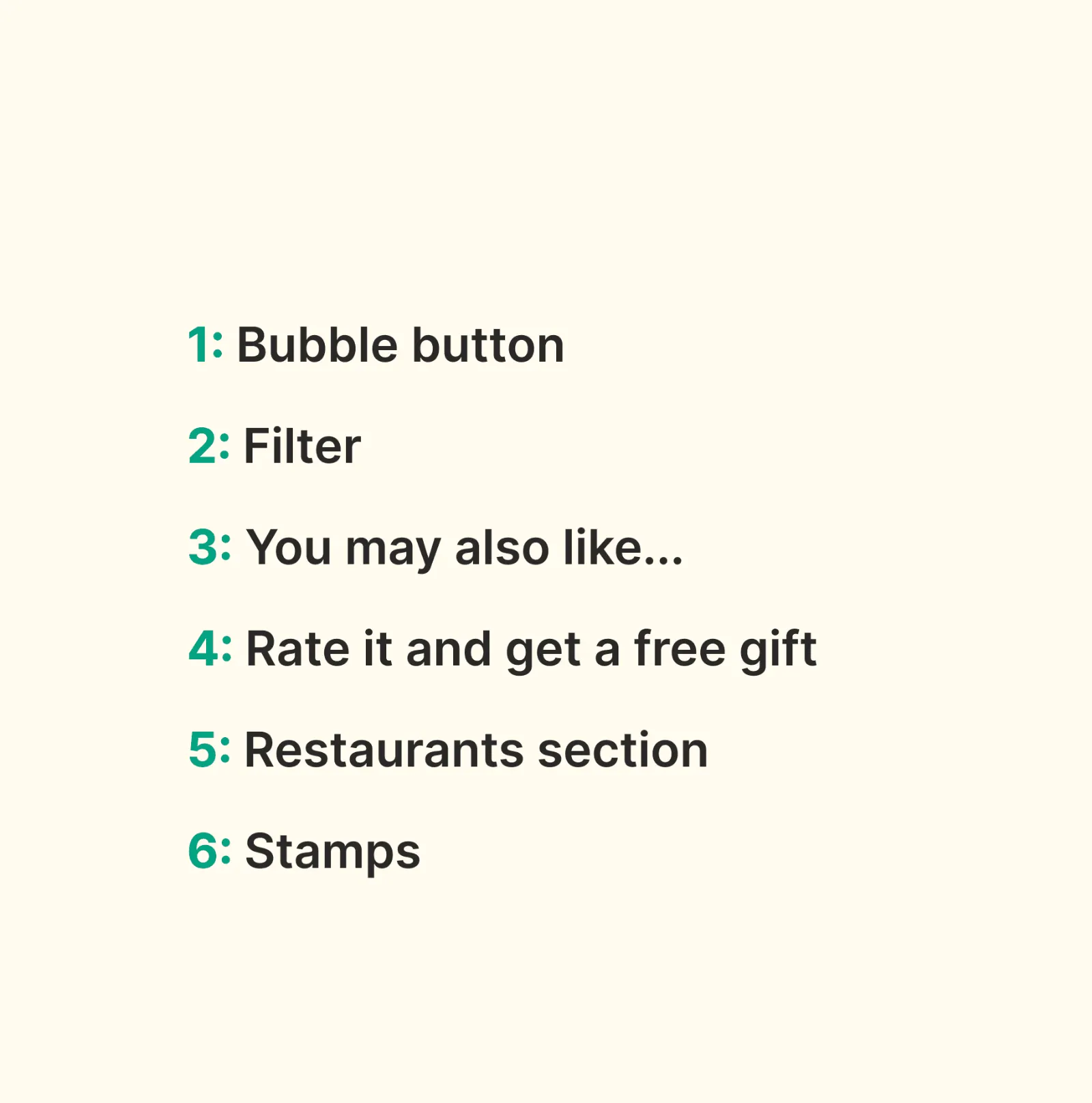
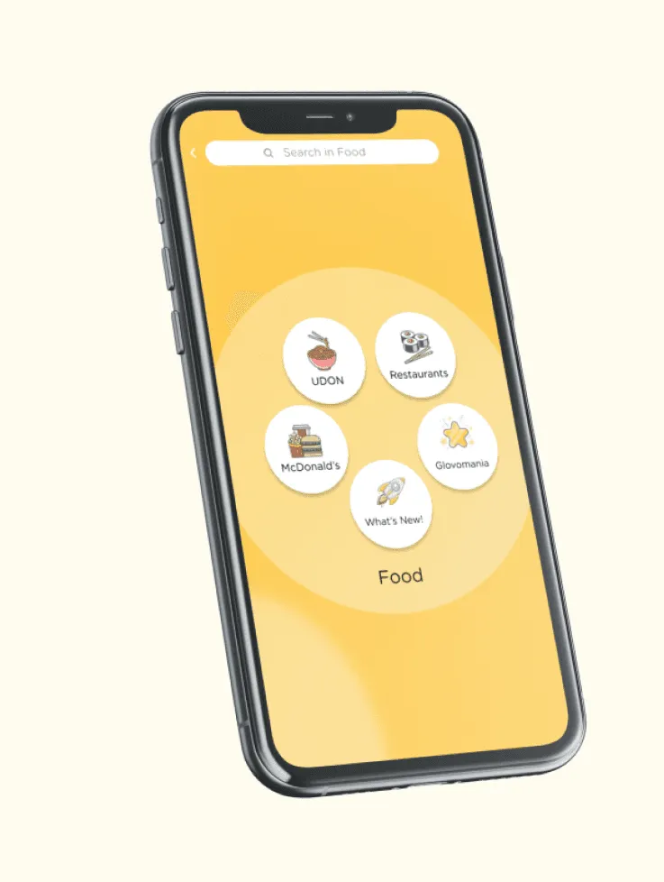
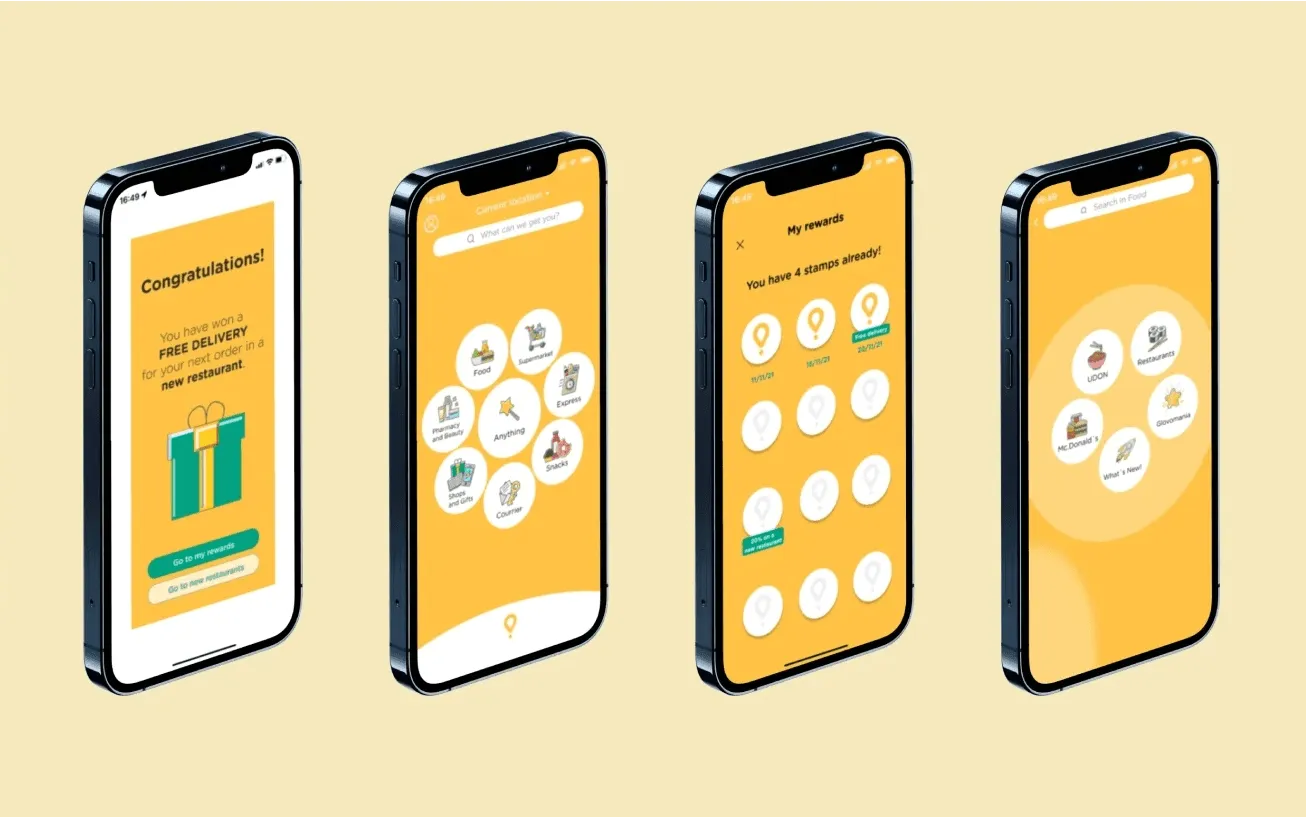
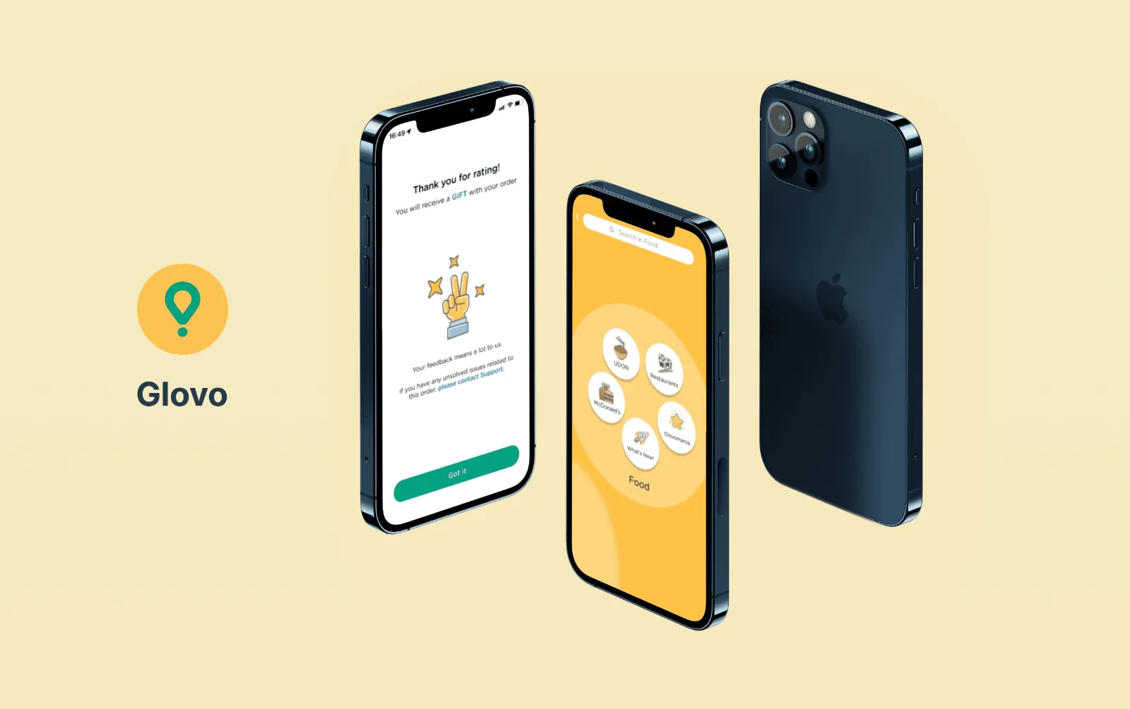
We designed and tested six solutions with real users: the Bubble Button, filters, "You may also like", rate-it-and-get-a-free-gift, a restaurants section and stamps. The most effective, the Bubble Button, placed new partners inside the user's usual ordering flow, making them visible without breaking habits.

The six tested solutionsThe Bubble Button on a phone
Solution screens on four phones
Takeaways
  • Design is validated through testing, not opinion.
  • Usability testing belongs throughout the project.
  • Real users in real contexts prove what works.
← All projects Brand design

Creating a brand from scratch

ClientMulier (freelance)
IndustryWomen's health app
ServiceBrand identity
DateOct 2022 — May 2024
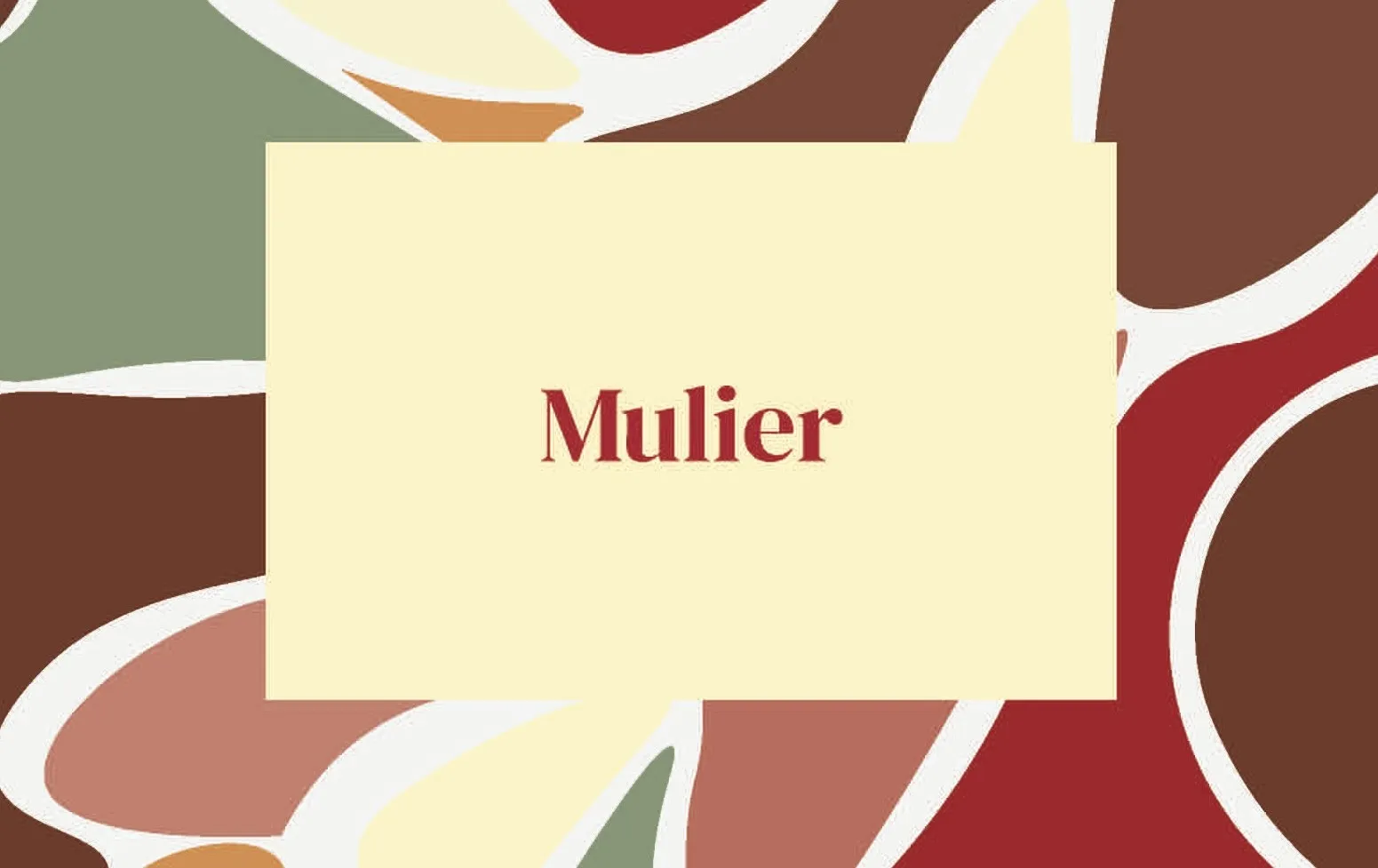
Mulier brand identity
Overview

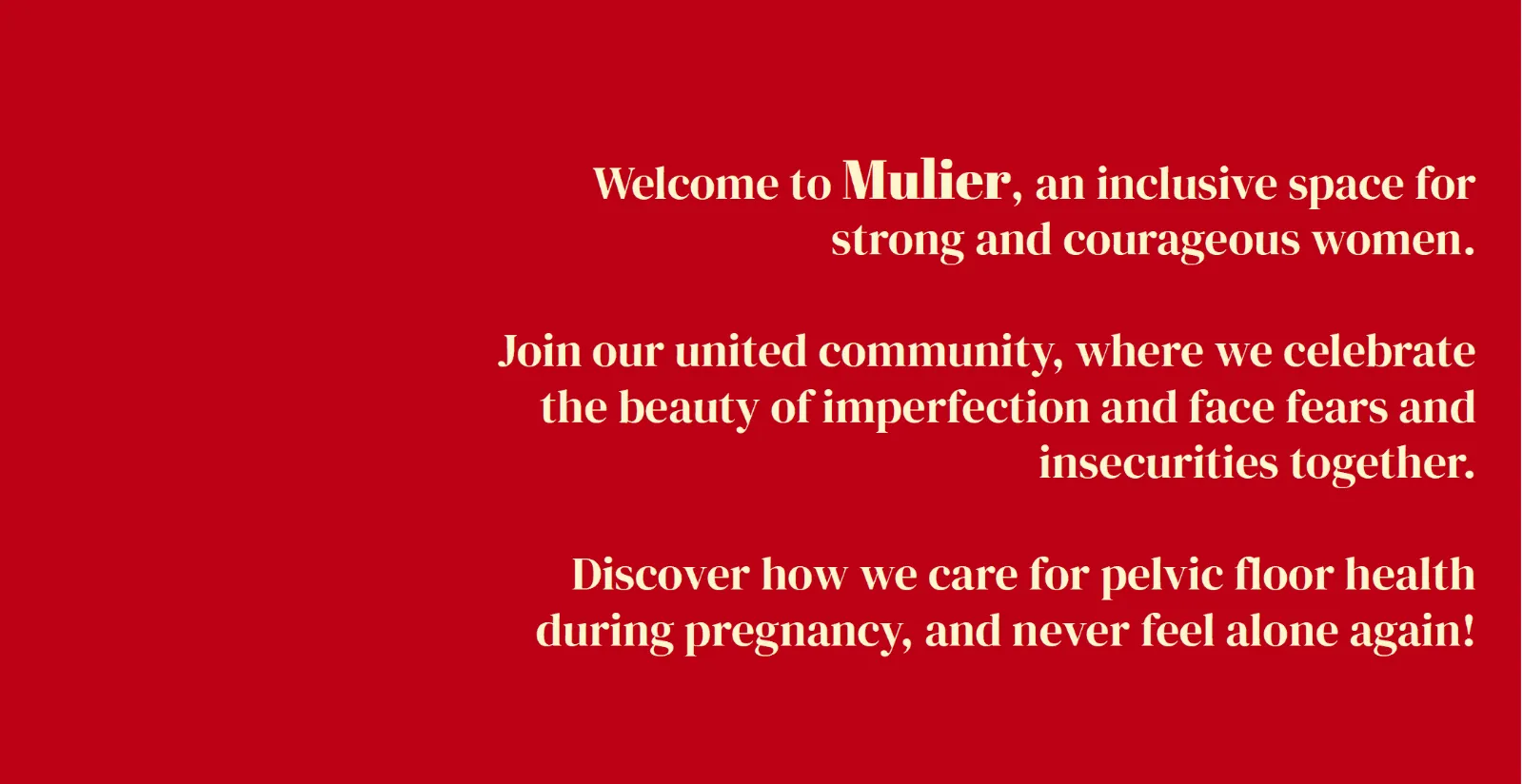
Mulier is a breastfeeding and pelvic-floor health app for women: an inclusive community that celebrates imperfection and supports women through pregnancy. The client needed a complete brand identity.

Mulier brand manifesto
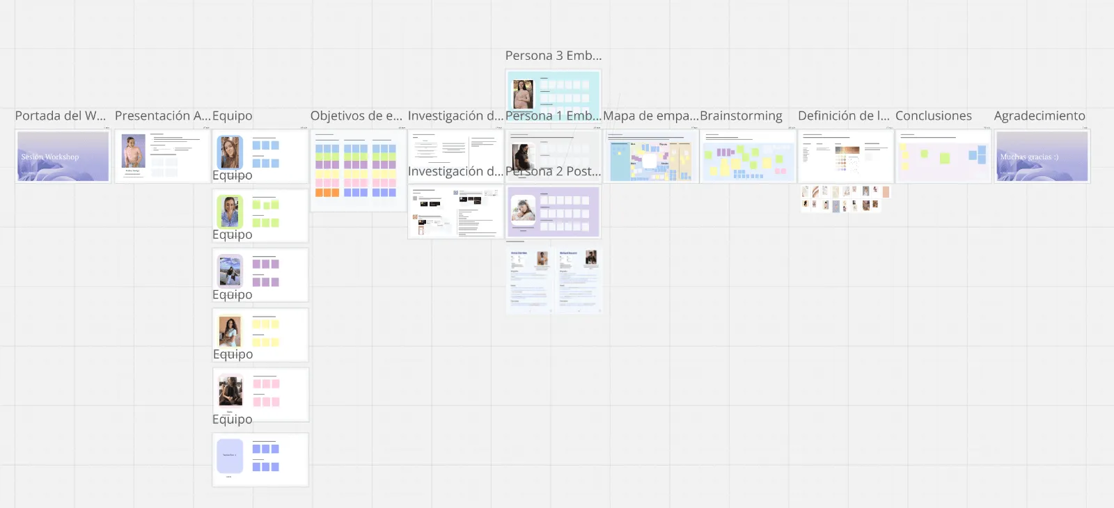
Workshop

I started with an alignment workshop to define the brand's style, essence and values together with the client.

Alignment workshop board
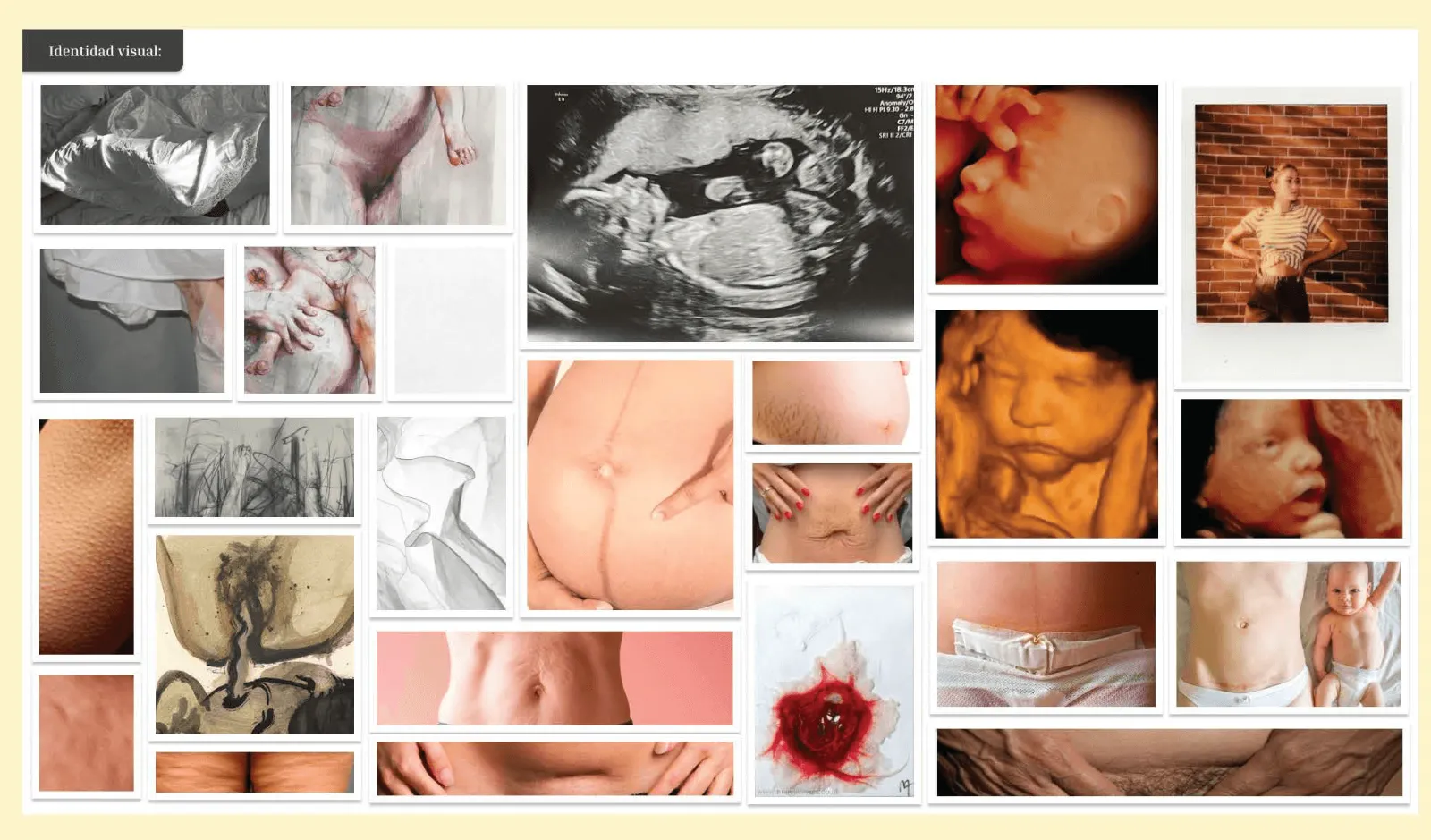
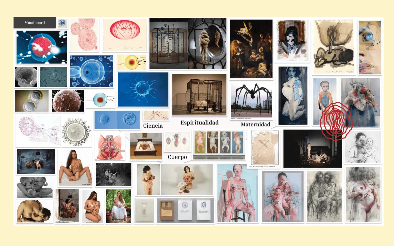
Moodboards

Visual research into the body, care and imperfection guided the typography, colour palette and iconography.

Moodboard 1
Moodboard 2
Brandbook

Everything came together in a brandbook: one source of truth for all future brand and marketing work. The same thinking I apply to design systems.

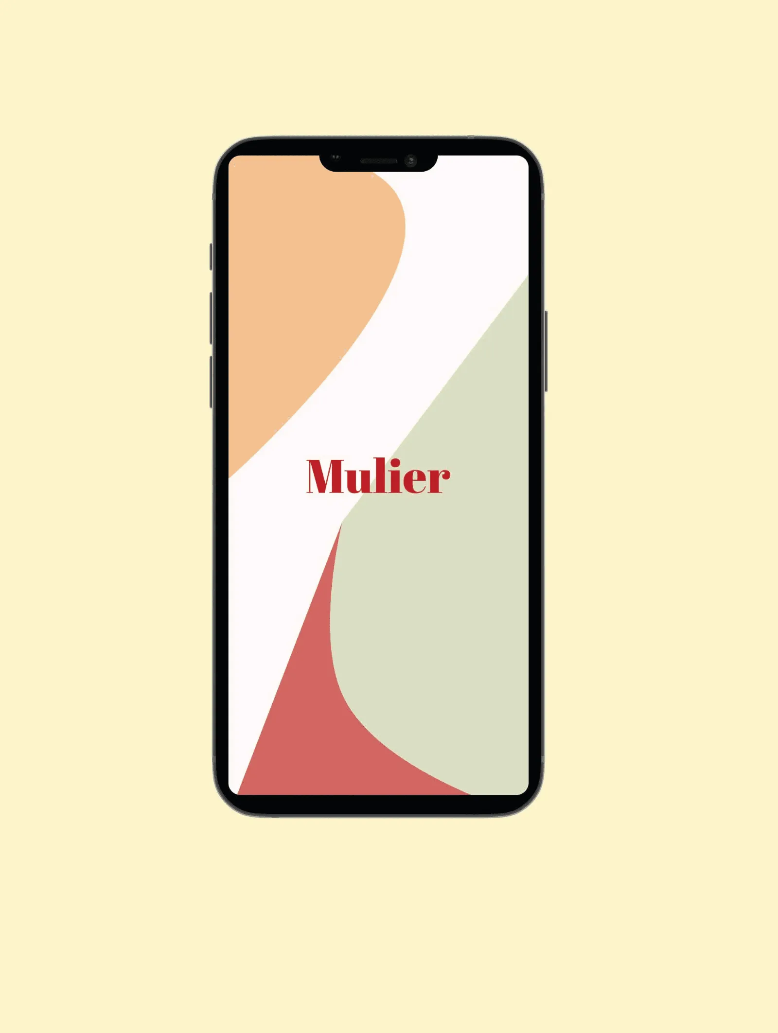
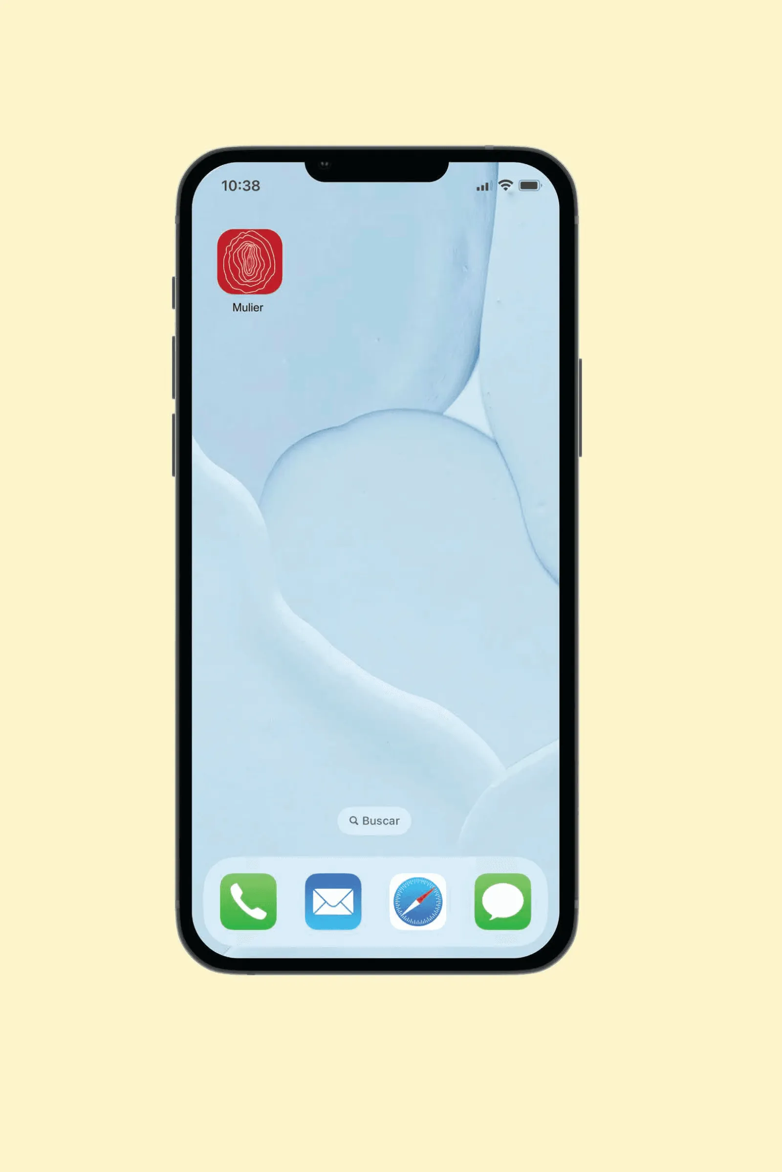
Mulier app splash screenMulier app icon on a home screen
Results

A strong, cohesive identity that helps the app stand out in a crowded market and connect with its audience of mothers.

← All projects App redesign

Creating a user-friendly app

ClientTalk (freelance)
IndustrySocial / messaging
ServiceApp redesign
DateApr 2024
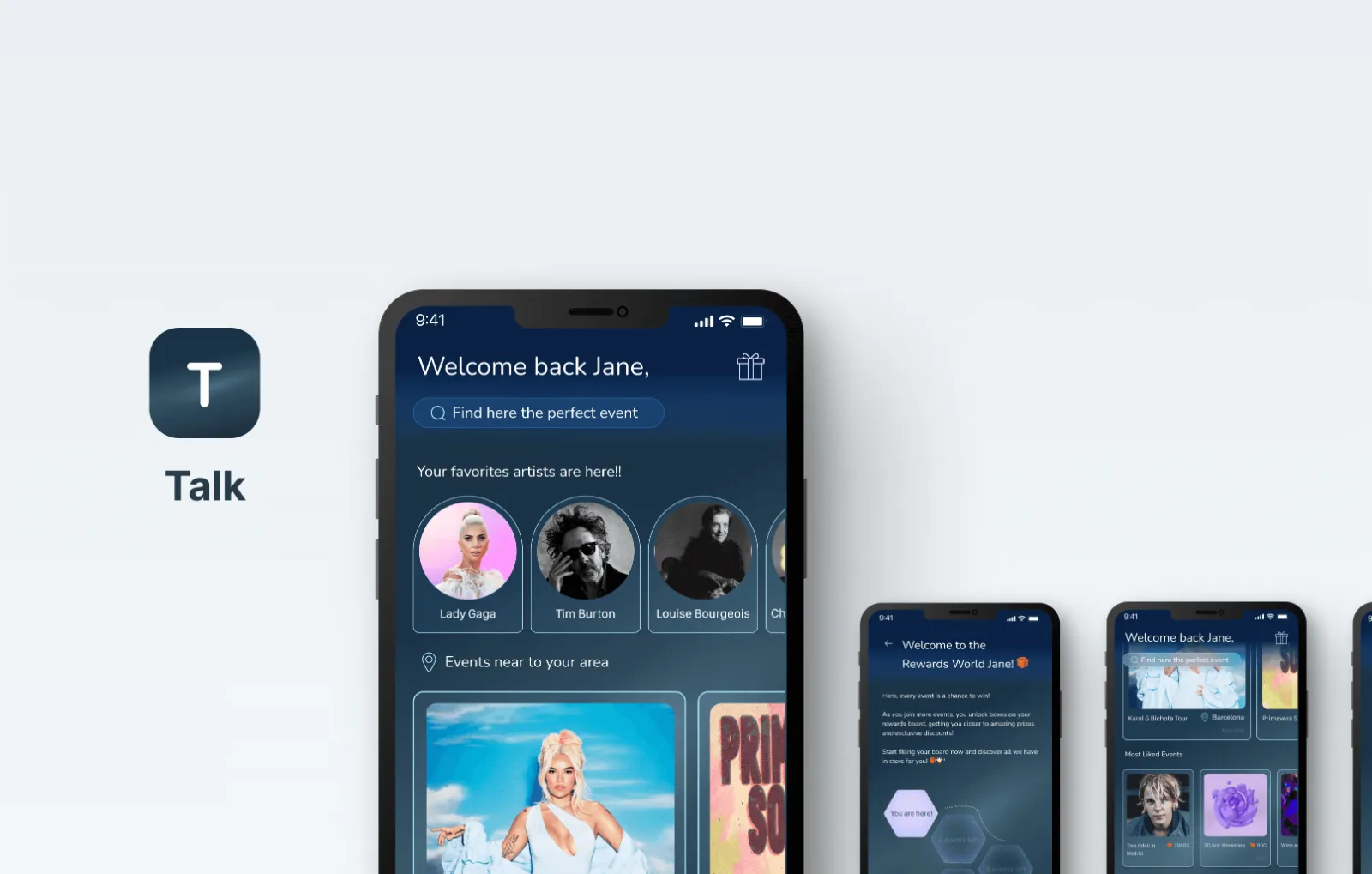
Talk app redesign
Overview

Talk is a messaging app that also connects people with their local community and nearby events. The client wanted more users to discover and attend events.

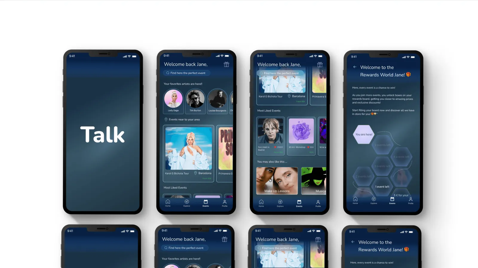
Talk app screens
Analysing the app

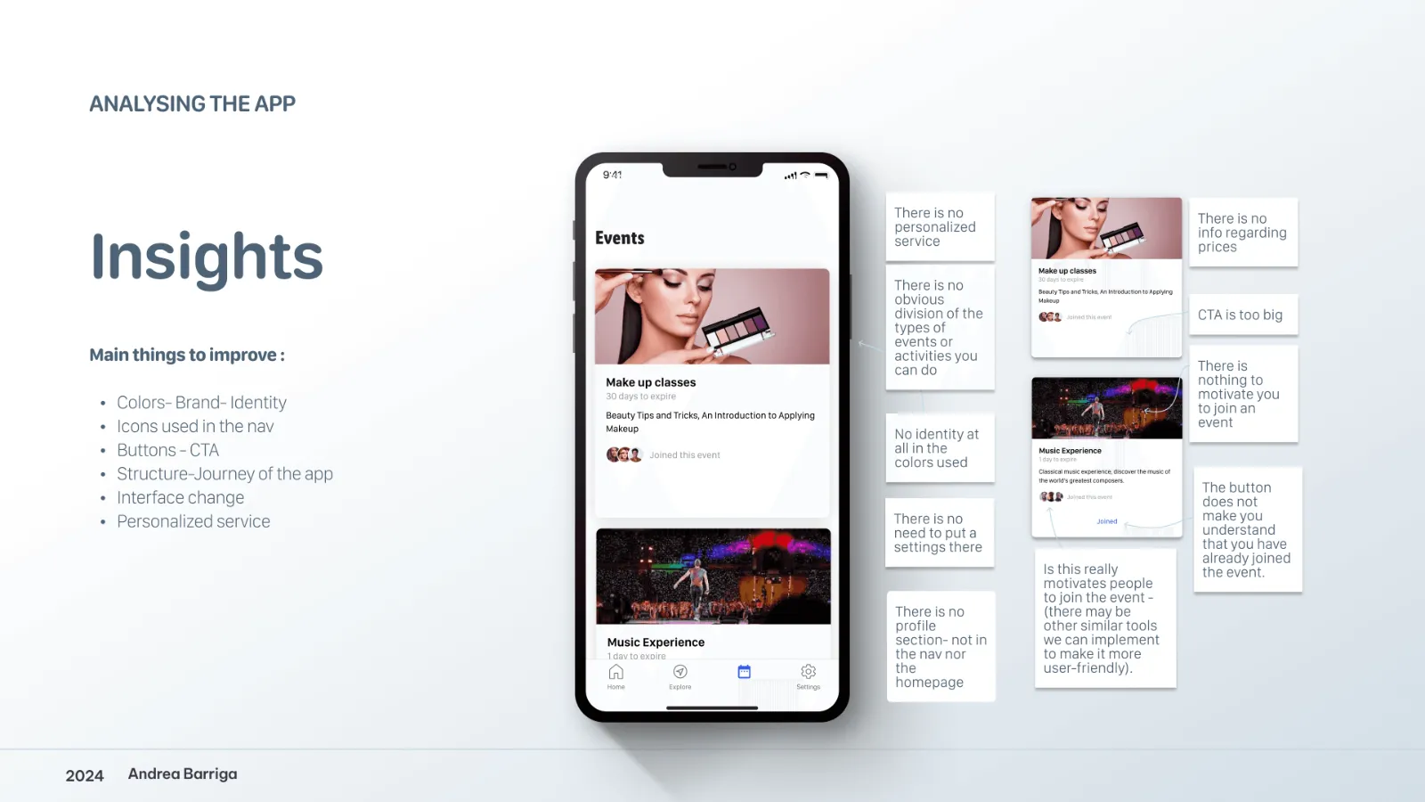
I audited the existing app with user feedback, analytics and usability testing, and studied competitors for patterns in navigation, interface and engagement.

Insights from analysing the app
Design

I redesigned the colours, iconography and layouts and reorganised the structure so navigation feels intuitive, prototyping and testing as I went.

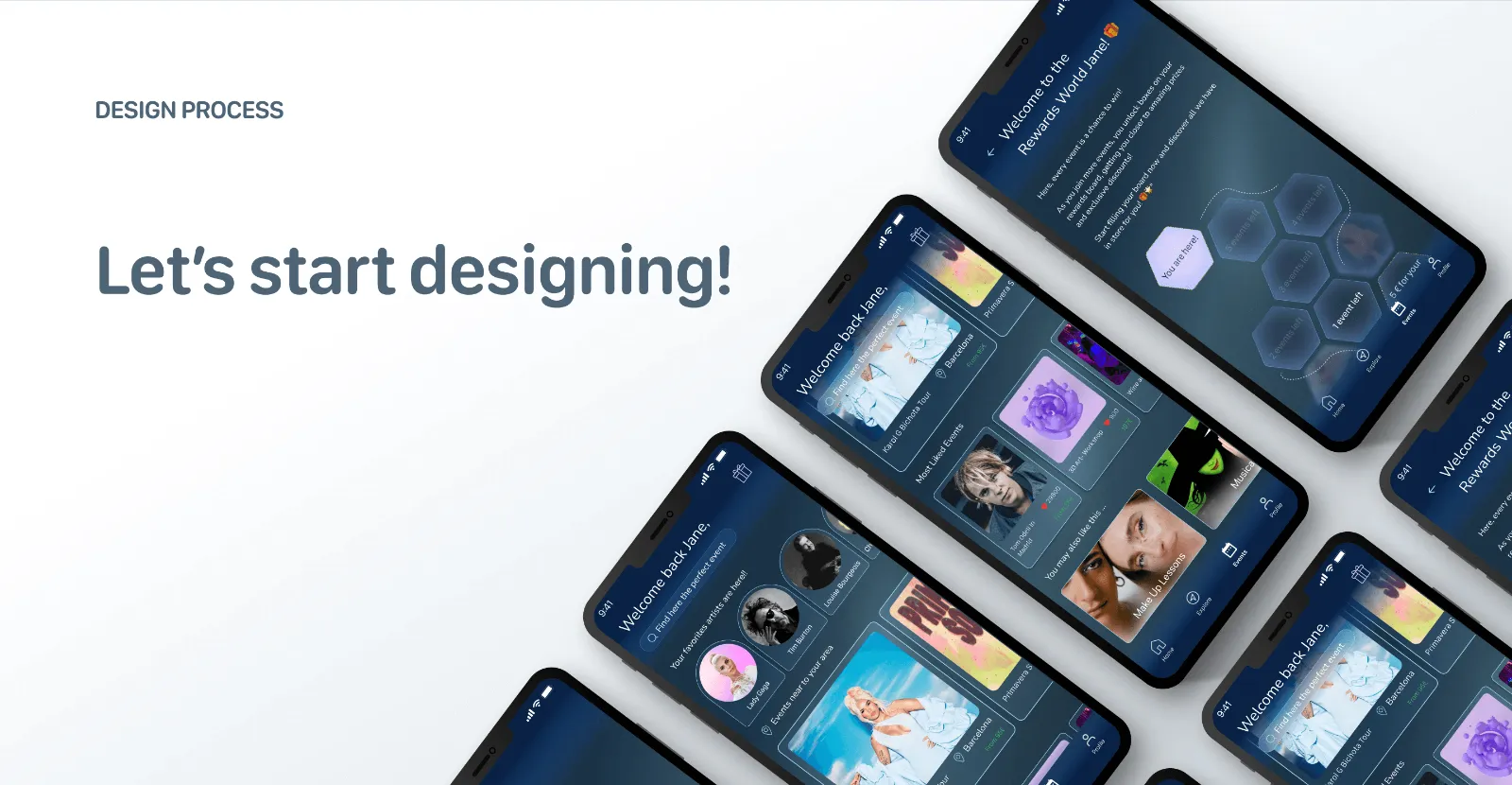
Let's start designing
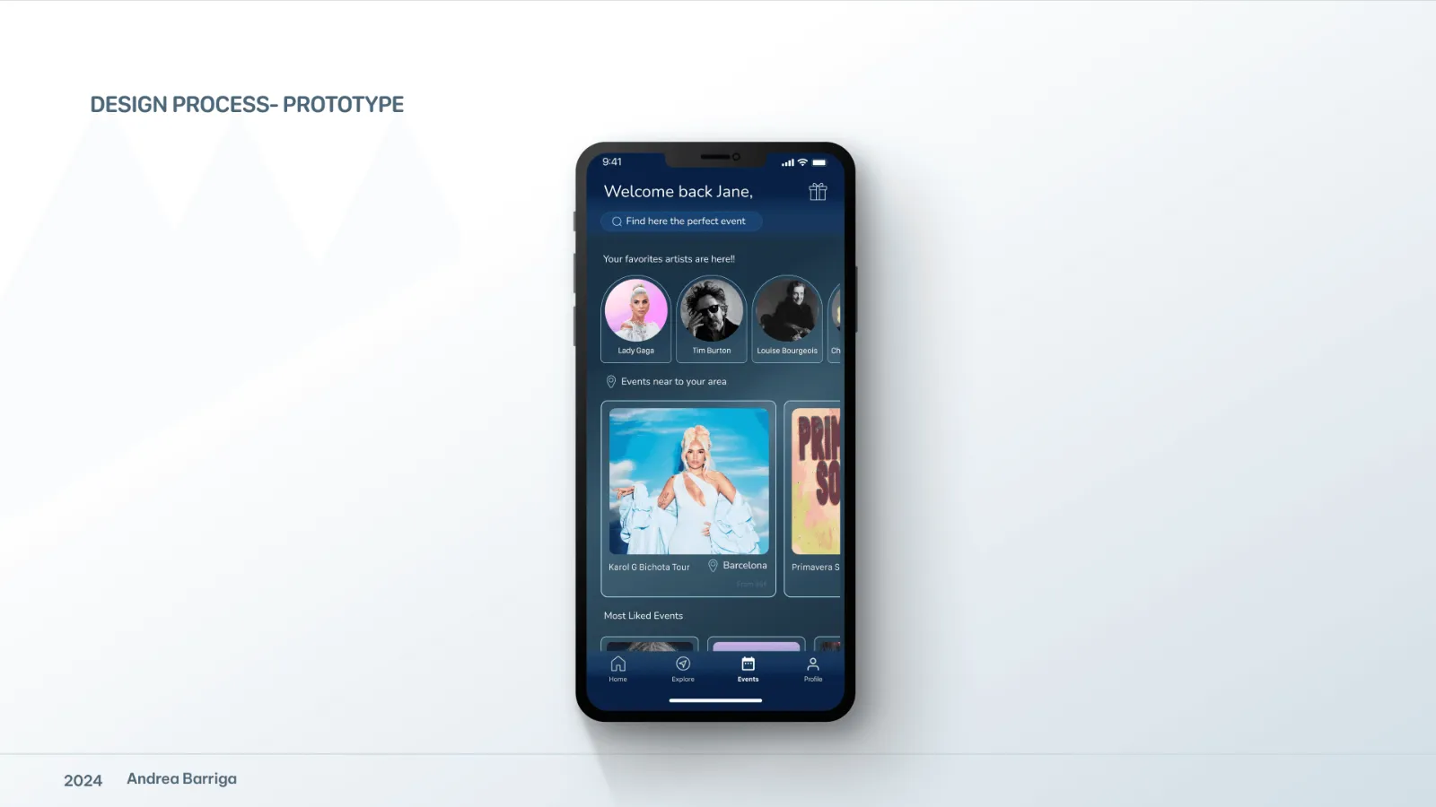
Design process prototype
Engagement
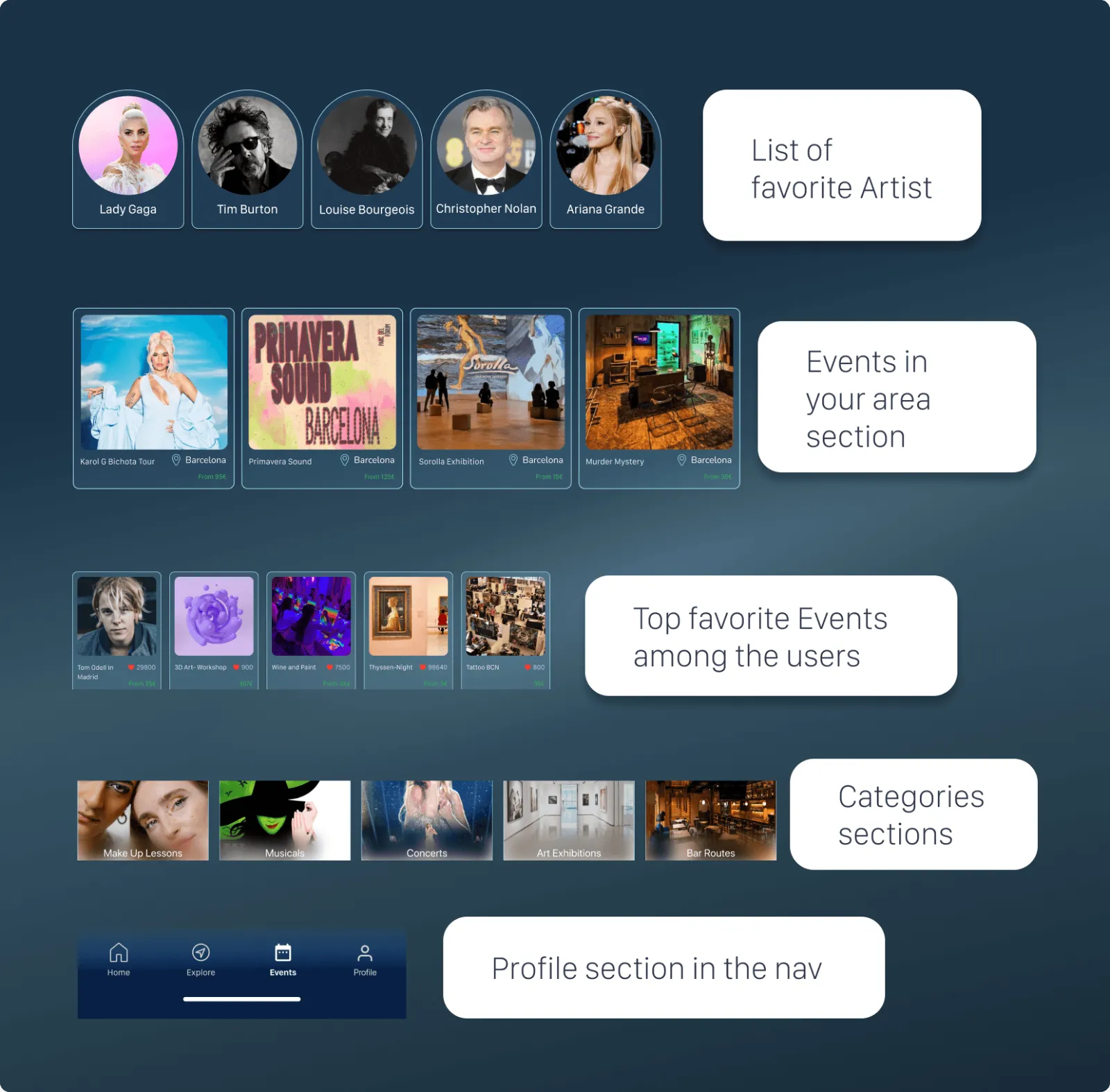
  • Personalised event recommendations
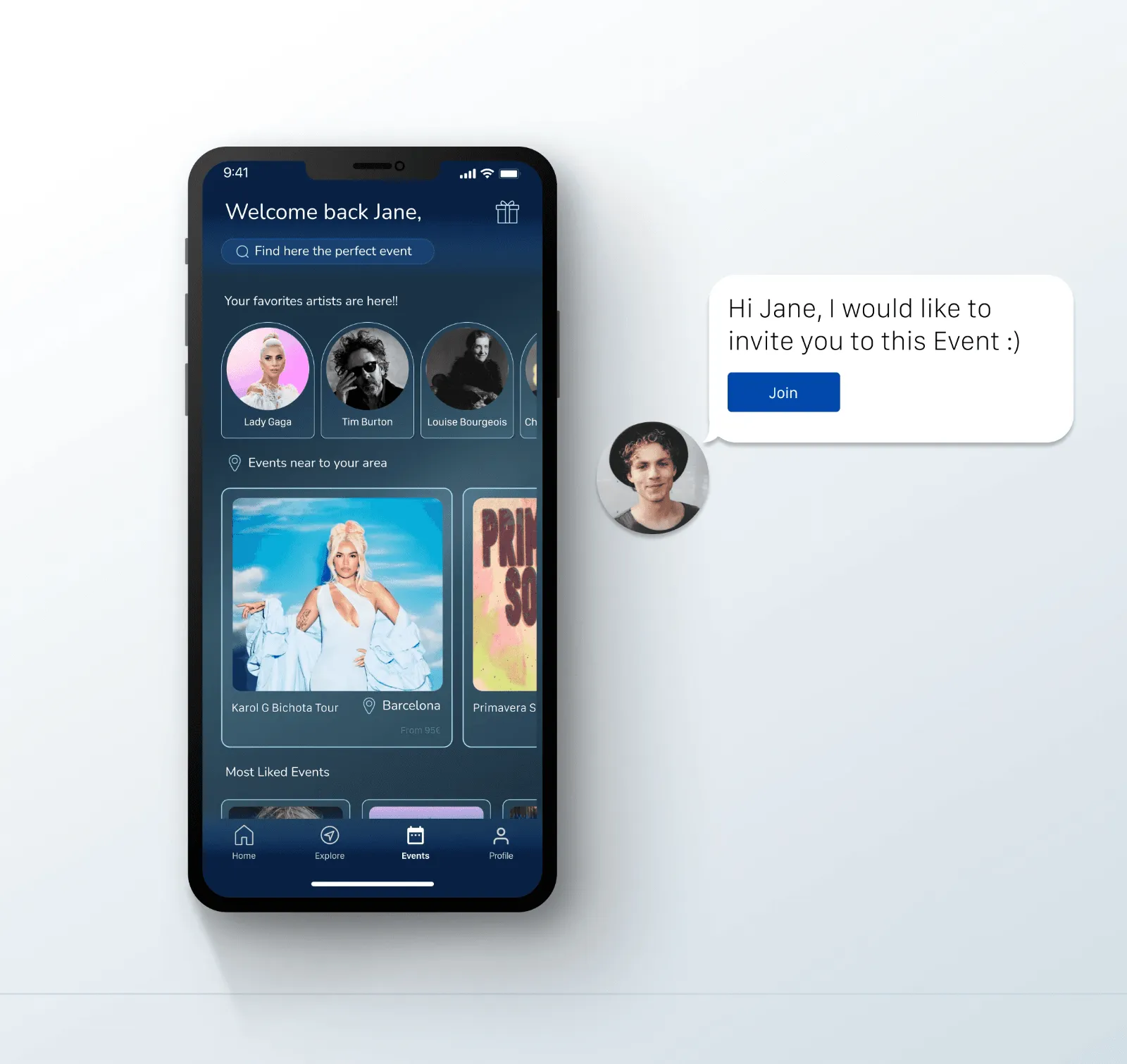
  • Social sharing, including seeing which contacts are attending
  • Event reminders and feedback
Events and categories screensChat and event invitation screen
Results

After user testing and iteration the redesign launched, made Events more engaging and exceeded the client's expectations.

← All projects App design · Features

Scheduled messages for WhatsApp

ProductWhatsApp
IndustryCommunication
ServiceFeature design
DateOct 2022
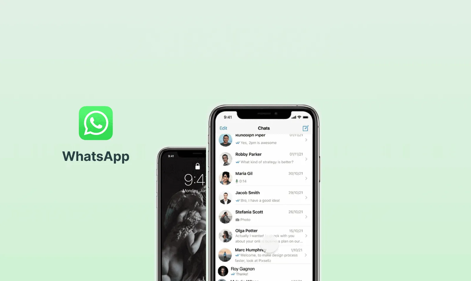
WhatsApp scheduled messages
Overview

A feature that lets users write a message now and have it sent automatically at a chosen time, designed to feel native to one of the world's most familiar interfaces.

Scheduled messages concept
Research

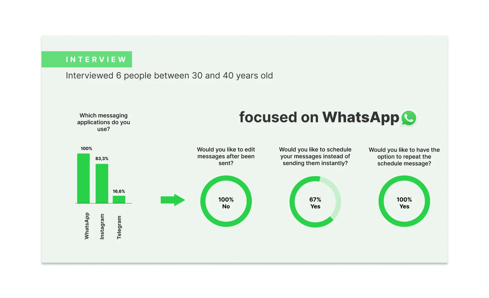
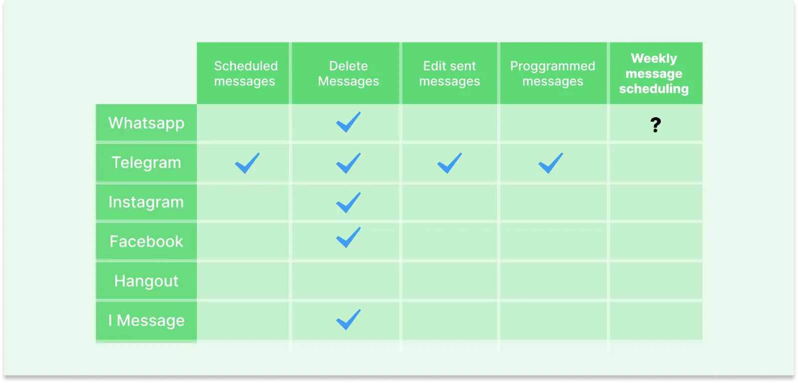
We interviewed six people aged 30 to 40 about how they use messaging apps, and benchmarked WhatsApp against Telegram, Instagram, Facebook, Hangouts and iMessage. None of them offered weekly scheduled messages.

Interview results
Feature benchmark across messaging apps
Design & testing

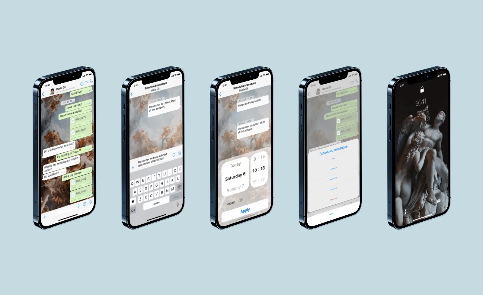
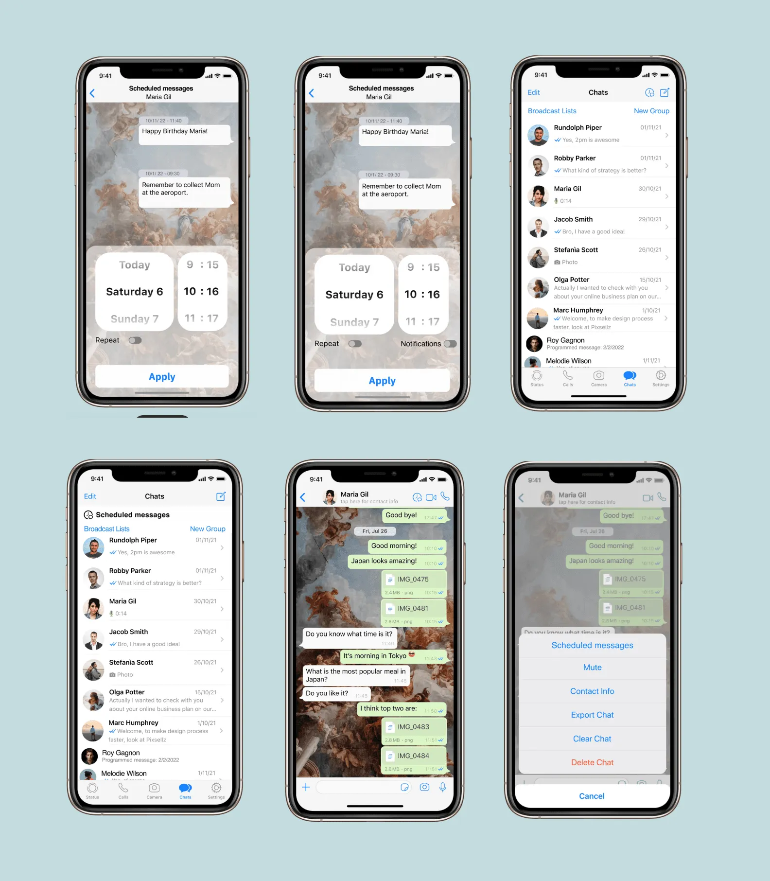
We tested the flow with a group of users and iterated on their feedback and technical feasibility, so the feature fits WhatsApp's existing patterns instead of working around them.

Scheduled messages flow on five phones
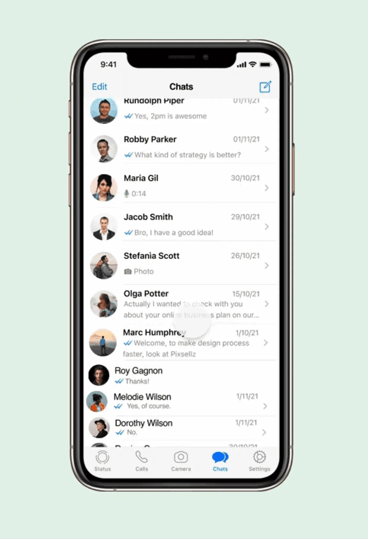
Screen flowChat list with scheduled messages
← Art work My recent art work · Portrait

Metamorphosis of the Portrait

DisciplinePhotography
TypePortrait series
SubjectÁlvaro
DateJun 28, 2022
PortraitPhotography · 2022
Metamorphosis of the Portrait
Portrait series, image 1Portrait series, image 2
The story

Photography has been my favourite language for more than 14 years: the most intimate way to express my emotions and how I see the world. At 10, my father gave me my first compact camera. Through the viewfinder everything looked different, and I realised that behind every image there was a story waiting to be told.

At 15, after months of saving, I bought my first DSLR. That's when photography became an art form for me: a way to freeze time and capture the metamorphosis of moments, emotions and people.

Portrait series, image 3Portrait series, image 4
The project

I photographed Álvaro, one of my university classmates. I wanted to capture not only how he looks, but the person I'd come to know, shaped by the changes he went through during our university years.

Metamorphosis isn't always obvious at first glance. It's not about ageing, but about inner transformation. In his gaze I looked for the serenity and quiet maturity that now define him: the result of his own personal and emotional growth.

← Art work My recent art work · 3D Blender

My Personal Journey in 3D Creation

Discipline3D & animation
ToolsIllustrator, Blender
OutputAnimated 3D logo
DateFeb 25, 2021
3D · Blender3D & motion · 2021
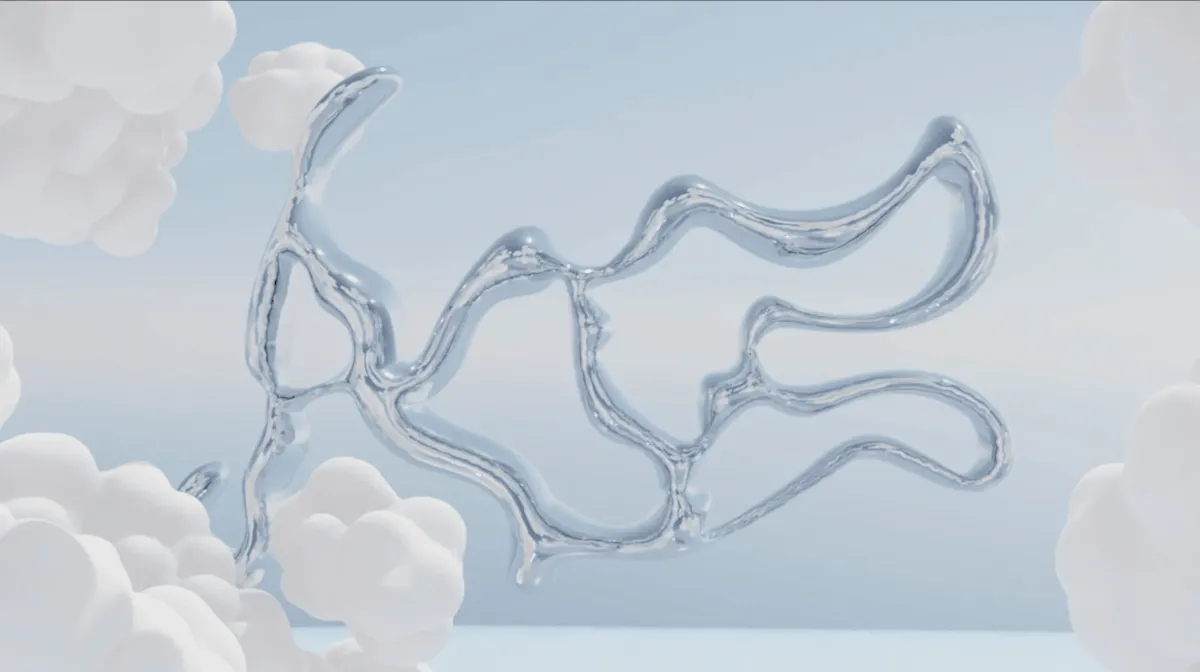
3D logo with clouds
Overview

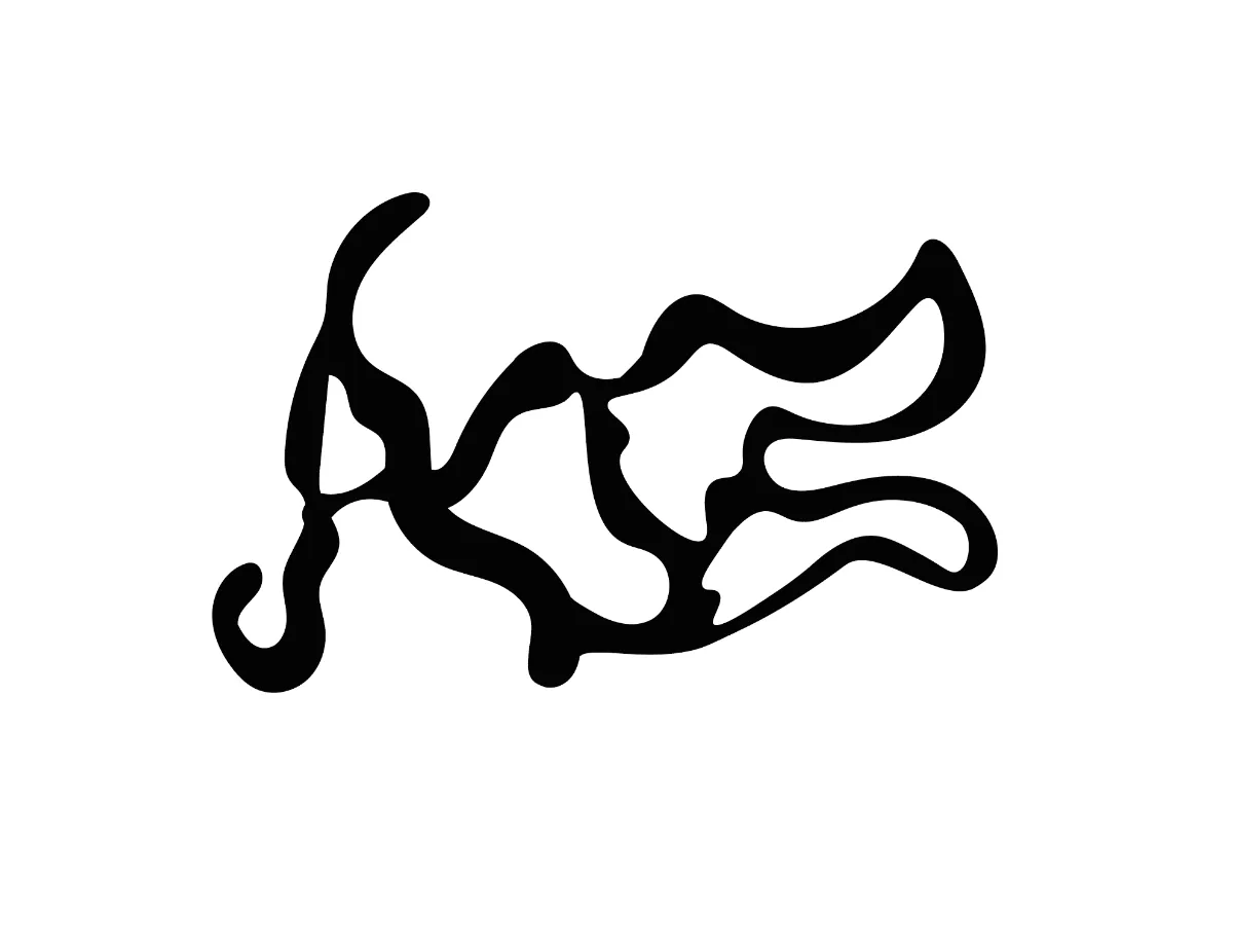
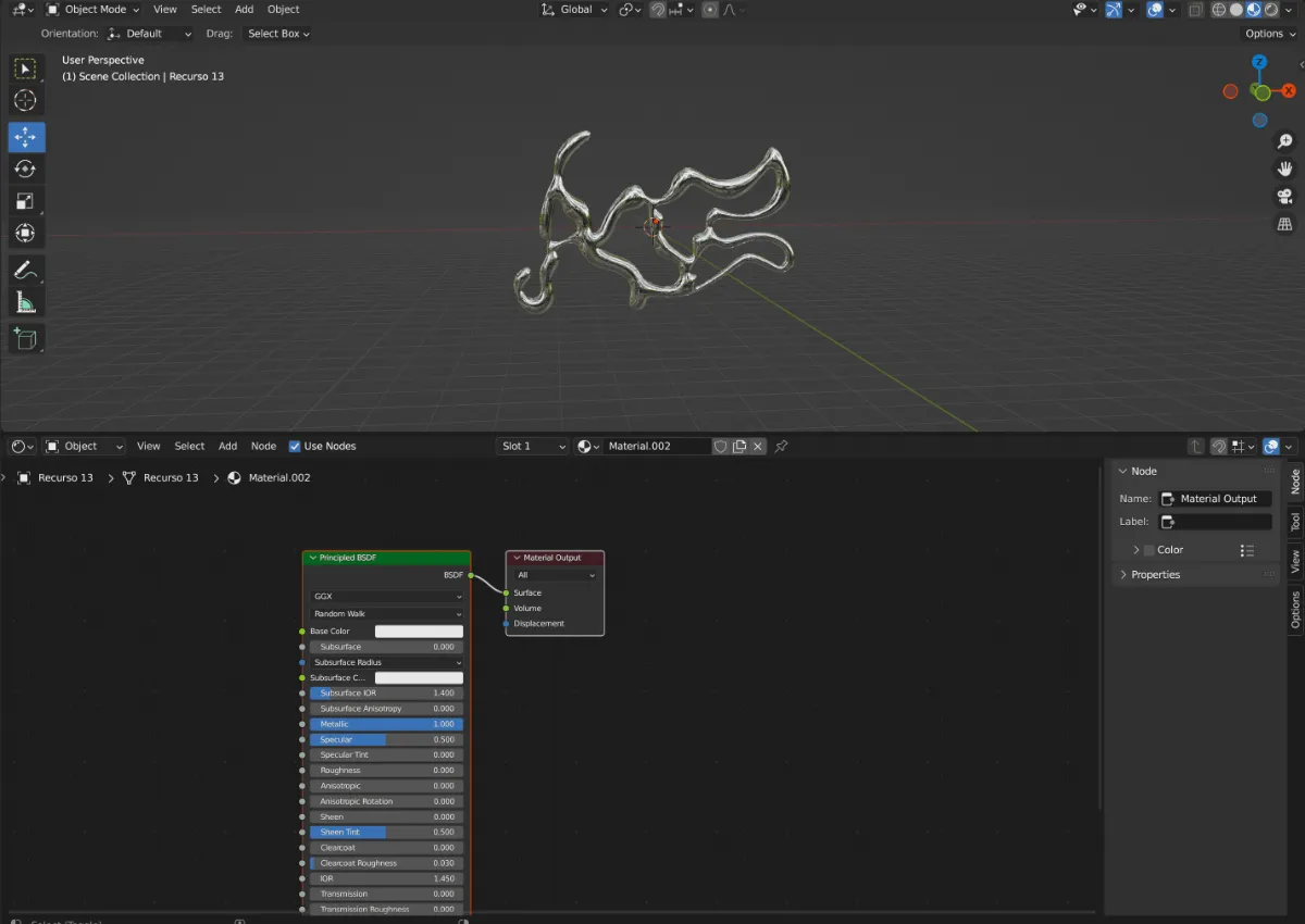
I brought my "AB" logo to life in 3D and animated it among clouds. It started in Adobe Illustrator as a flat vector, then moved into Blender for modelling, textures, depth and animation, all in one environment.

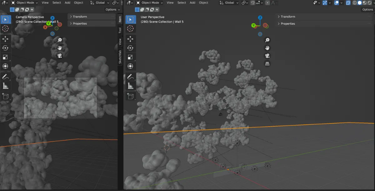
Cloud simulation in BlenderThe flat AB logoBlender node setup for the logo material
The challenge

Blender's versatility was also the challenge: I had to quickly learn everything from modelling the logo to simulating natural effects like moving clouds, and blend it all into one seamless animation.

The clouds were where the real creative shift happened. I wanted to capture the fluidity and constant change of nature, a symbol of the passage of time and of my own evolving creative process. From flat vector to textured, animated form, the project is a small metamorphosis in itself.

← Art work My recent art work · Art

"In"sensibilities in the Digital Age

DisciplineFine art photography
TechniqueImage fusion
ReferenceF. "Bifo" Berardi
DateJan 02, 2020
Fine artImage fusion · 2020
Insensibilities in the Digital Age
Concept
"We are losing the ability to detect the undetectable."Franco "Bifo" Berardi, Phenomenology of the End

The rise of digital mutations, information overload and our ever-changing digital environment are making us less sensitive. This project centres on that idea.

Fused photograph, colour
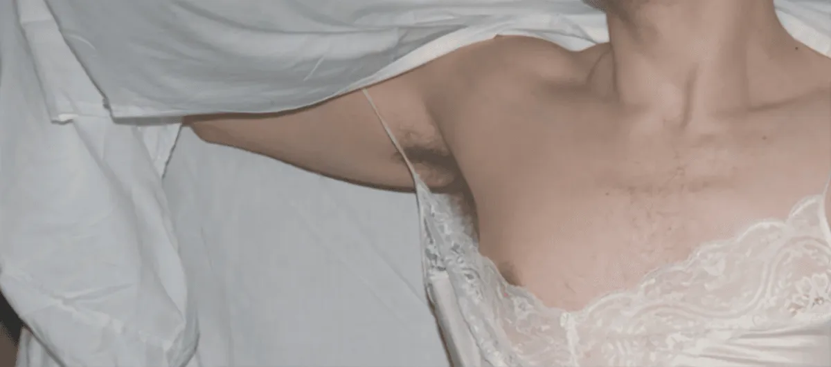
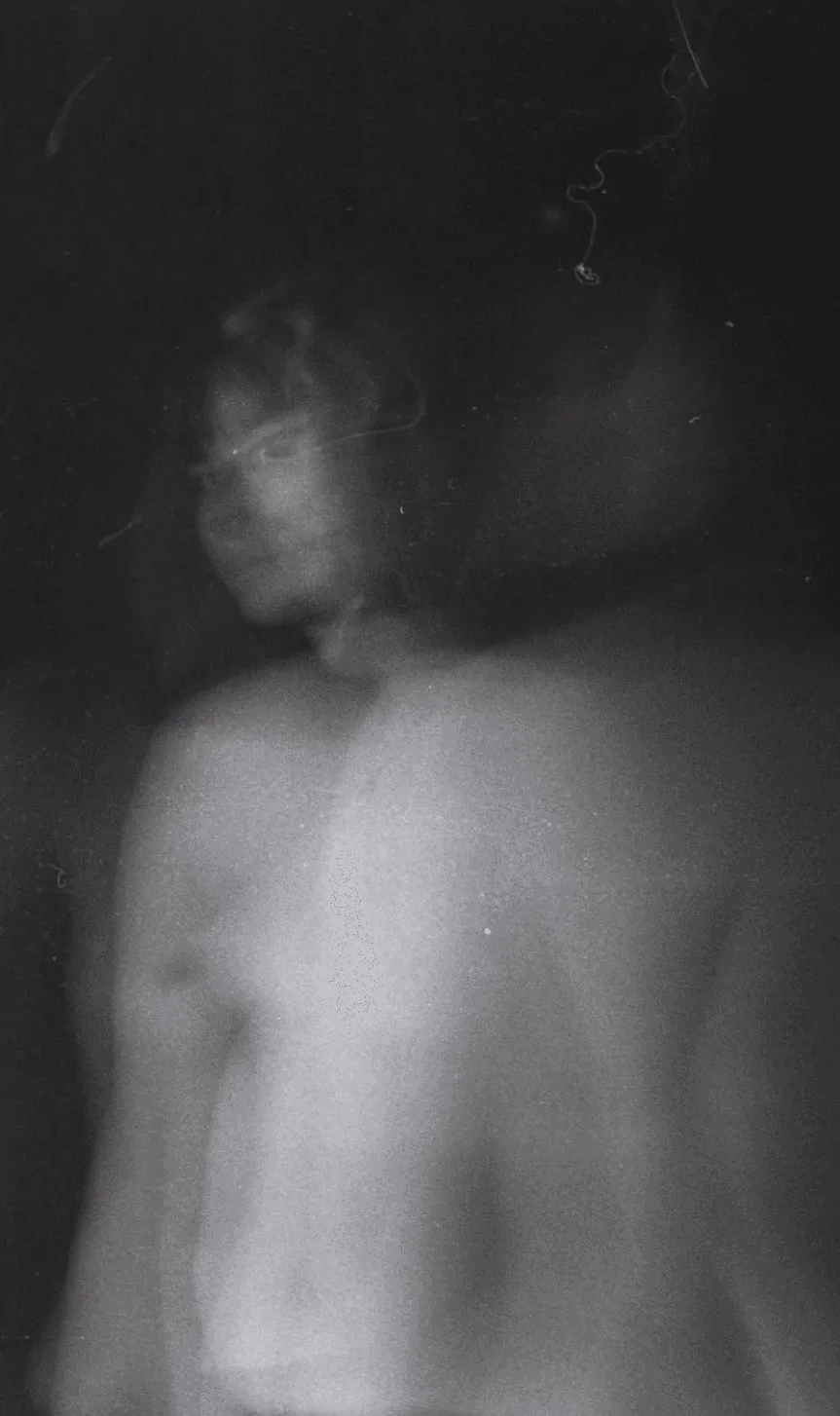
Portrait wrapped in a white sheetBlurred black-and-white figure
The work

By fusing images, I build new visual narratives that create resistance between the body and emotion. Past and future merge in an insensitive present, in an exchange of gazes between viewer and viewed.

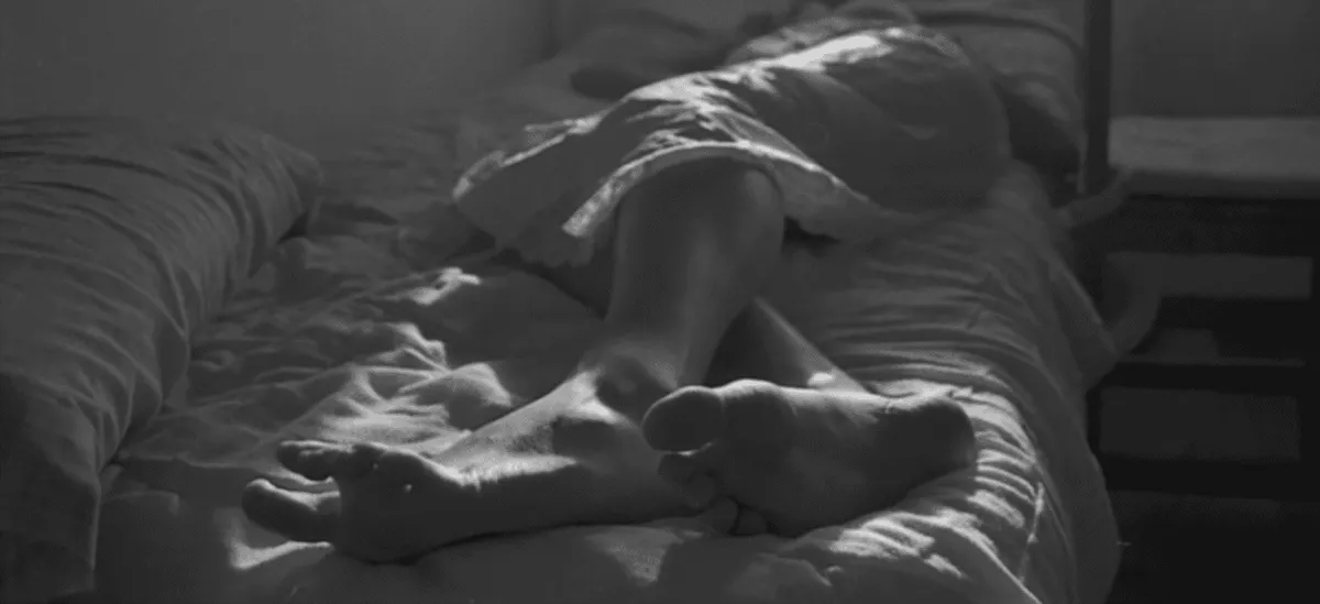
The composition works as a double window: the punctum of the present, in colour, against the moment of the past, in black and white.

Fused photograph, black and white
Get in touch

Let's talk

andreadprado99@gmail.com
LinkedInEmail